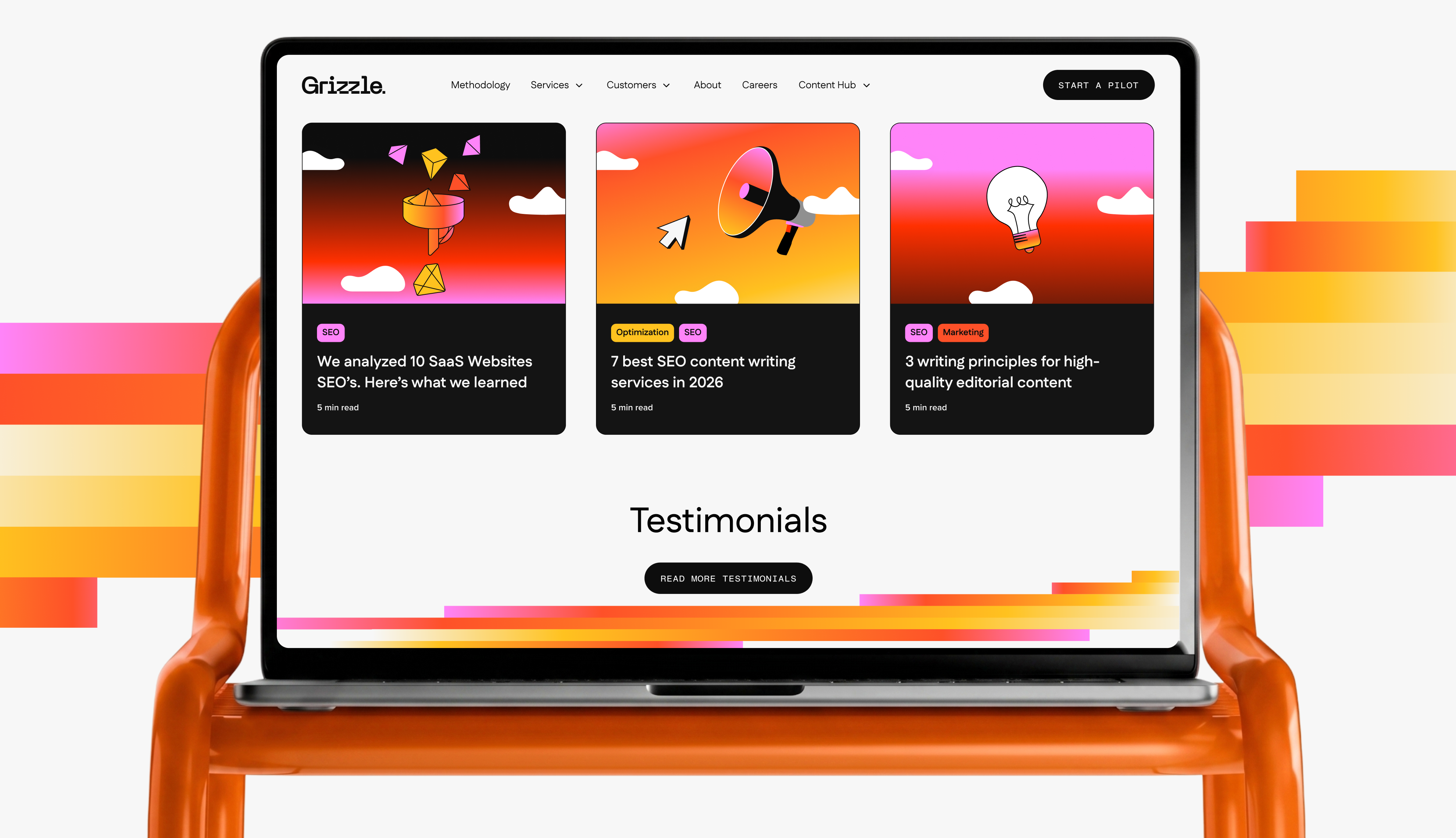
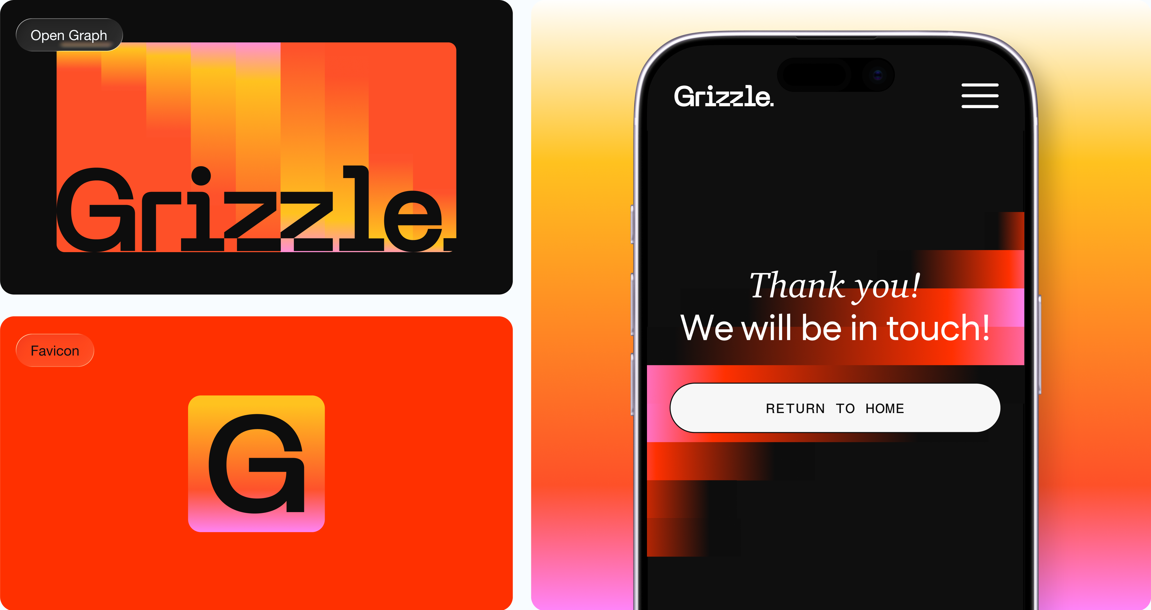
Grizzle is a London-based organic growth agency offering full-funnel content, SEO, and digital PR for B2B and SaaS brands. The CEO had built the original logo in 2016 using a Google Font, GIMP, and some creative letter spacing. That approach had lasted nearly a decade, and Grizzle had simply outgrown it. They were targeting VP, Director, and CMO-level buyers at post-Series A companies with $10M+ ARR, and the website wasn't meeting those buyers where they needed to be met. Their positioning wasn't landing with the ICP they were moving upmarket toward, and the visual identity had no coherence. A rebrand was down to a credibility problem. Their goals going in were clear: increase authority, create a brand identity that could sustain them for the next five to ten years, and stand apart from a competitor set (Animalz, Grow & Convert, Omniscient Digital) that largely looks the same: clean, safe, forgettable. The CEO wanted something B2C-inspired in a B2B space: a little cooky, still professional, but never boring. He also wanted the site to convert: structure, copy, and flow were all in service of turning visitors into pilot enquiries.
Team
Creative Direction: Juan Pablo Project Management: Mandy Arocha Brand Design: Denis Dallo UI Design: Laura Misuraca Graphic Design & Illustrations: Hector Salazar Webflow Developer: Usman Raza
Industry
Marketing, SaaS, B2B
Scope, Output & Timeline
Scope: End-to-end UI design Output: Design + Dev handoff & QC Recognition: Award submission Timeline: ~4 months (wireframing through to website launch)
Tools
Figma, Adobe Suite, Webflow, Illustrator, Loom, Markup
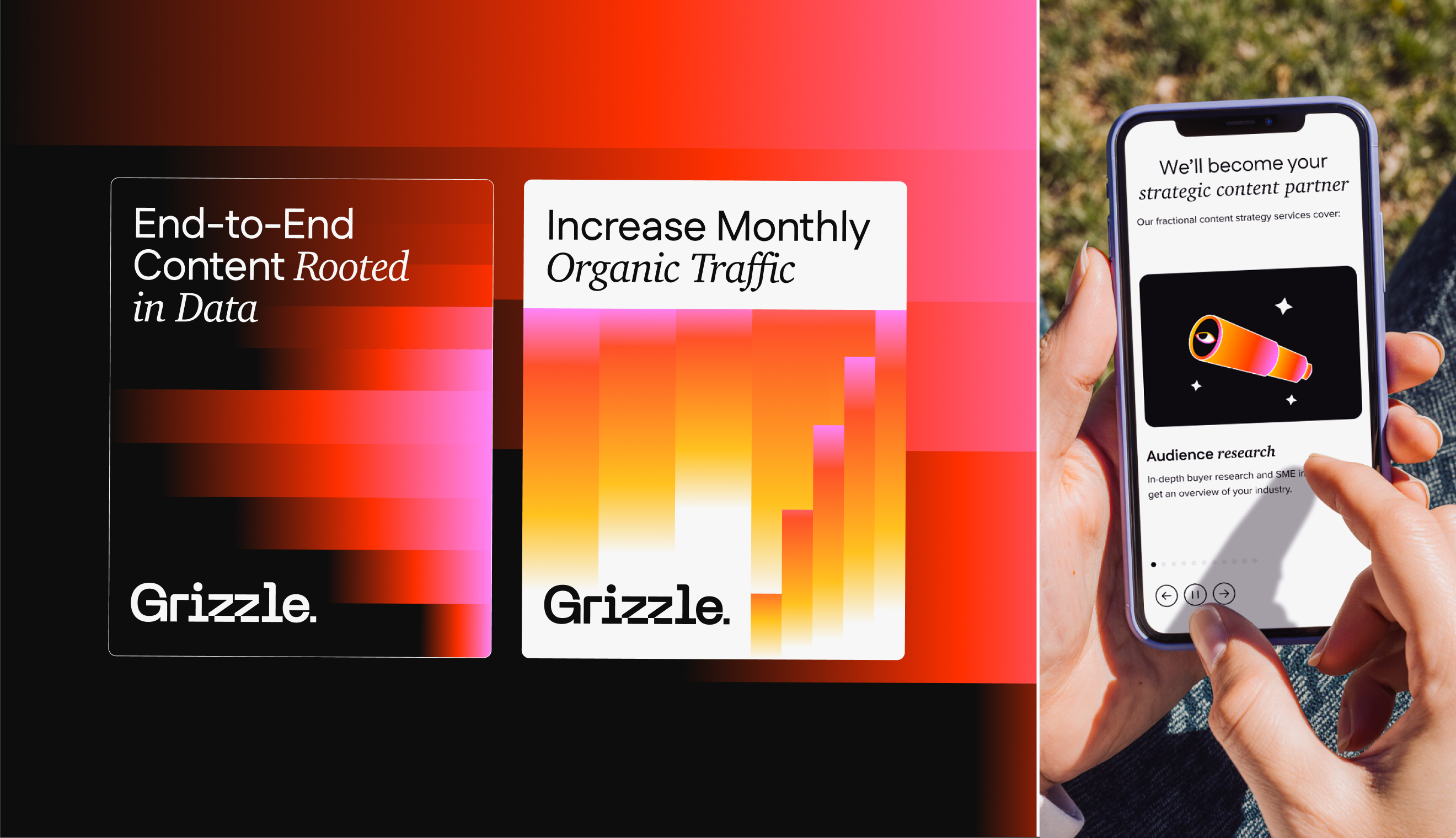
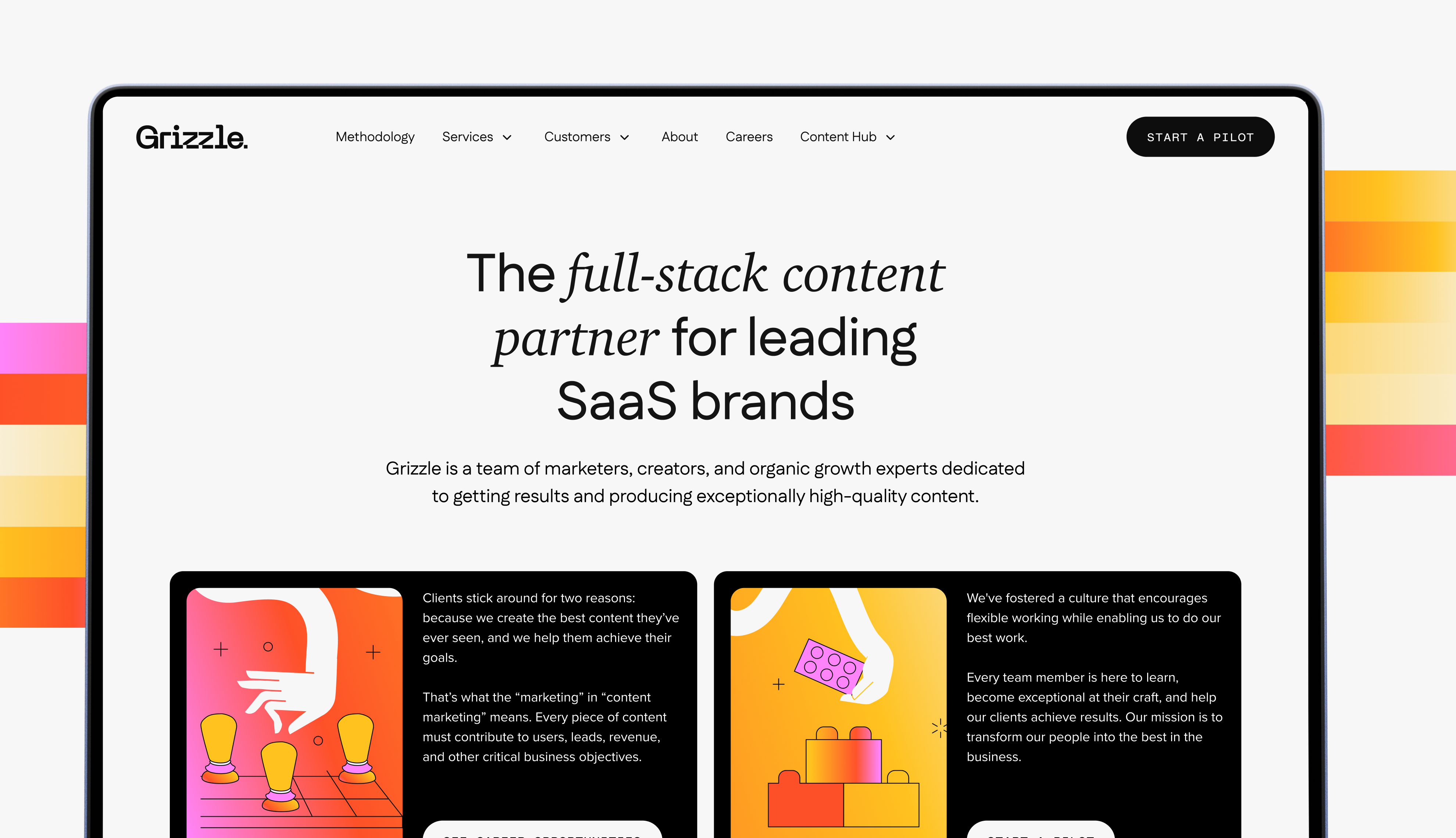
I came into this project at the wireframing stage, as the brand sprint was wrapping up. The brief I inherited was essentially: the brand is done, now build a website around it. Client copy was provided, but information architecture was ours to define. I was given latitude to restructure the sitemap, add or remove sections, and make calls about what served conversion and what didn't.
Before touching a frame, I reviewed the kick-off questionnaire, the ICP doc, and the brand guidelines. I also looked at the visual references the client had flagged: Superside, Exit Five, and Lemon.io. These were supplied as visual proof points for what B2C-influenced B2B design could look like without losing credibility.
The main constraints going in:
I made one key decision early on that saved us a lot of time later on: building components from the wireframe stage rather than waiting for UI. The site had a high degree of repeated elements: nav, footer, CTAs, case study tiles, testimonials, etc. Building those, even just locally, from the start made the transition from wireframe to UI much smoother.
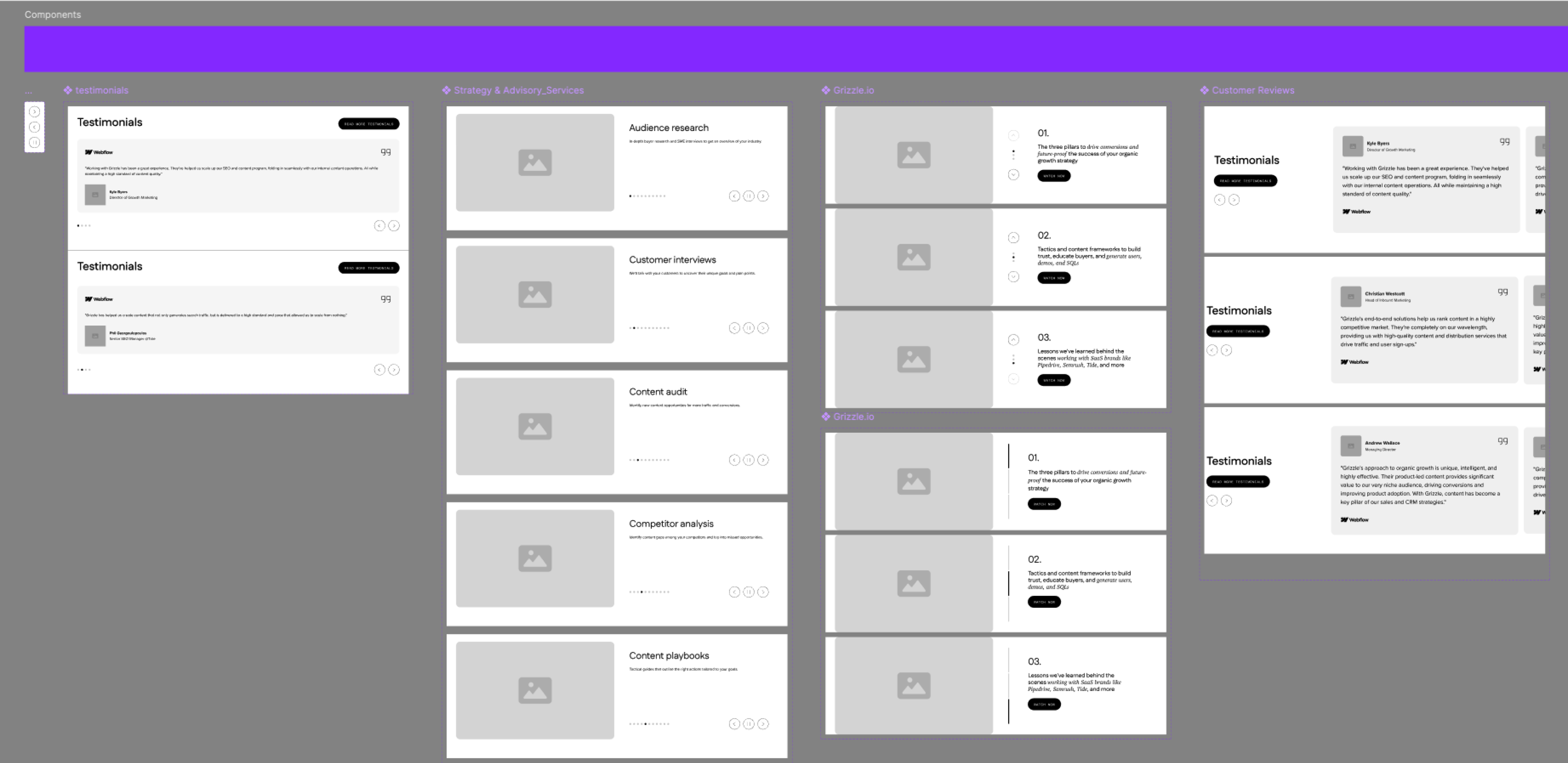
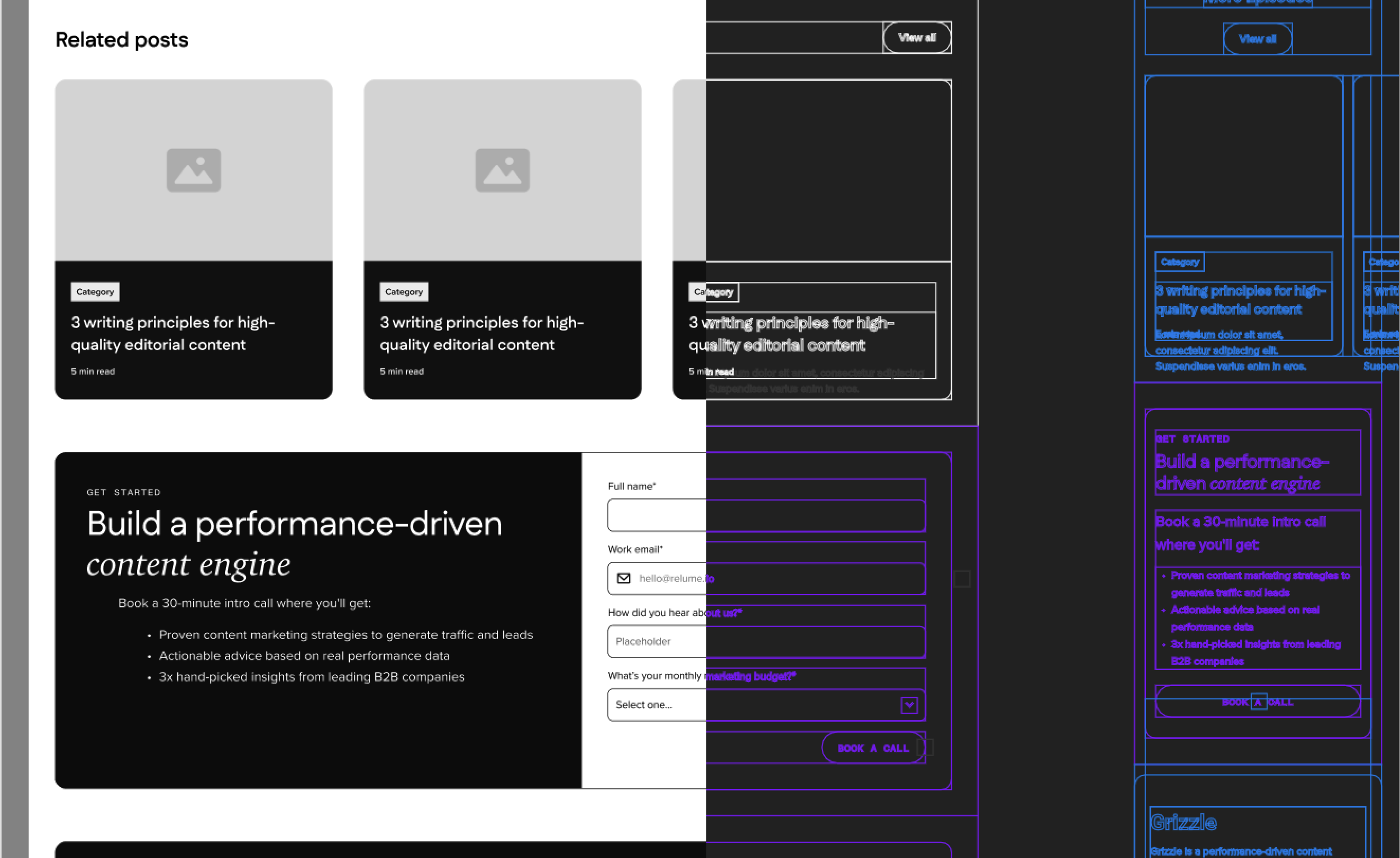
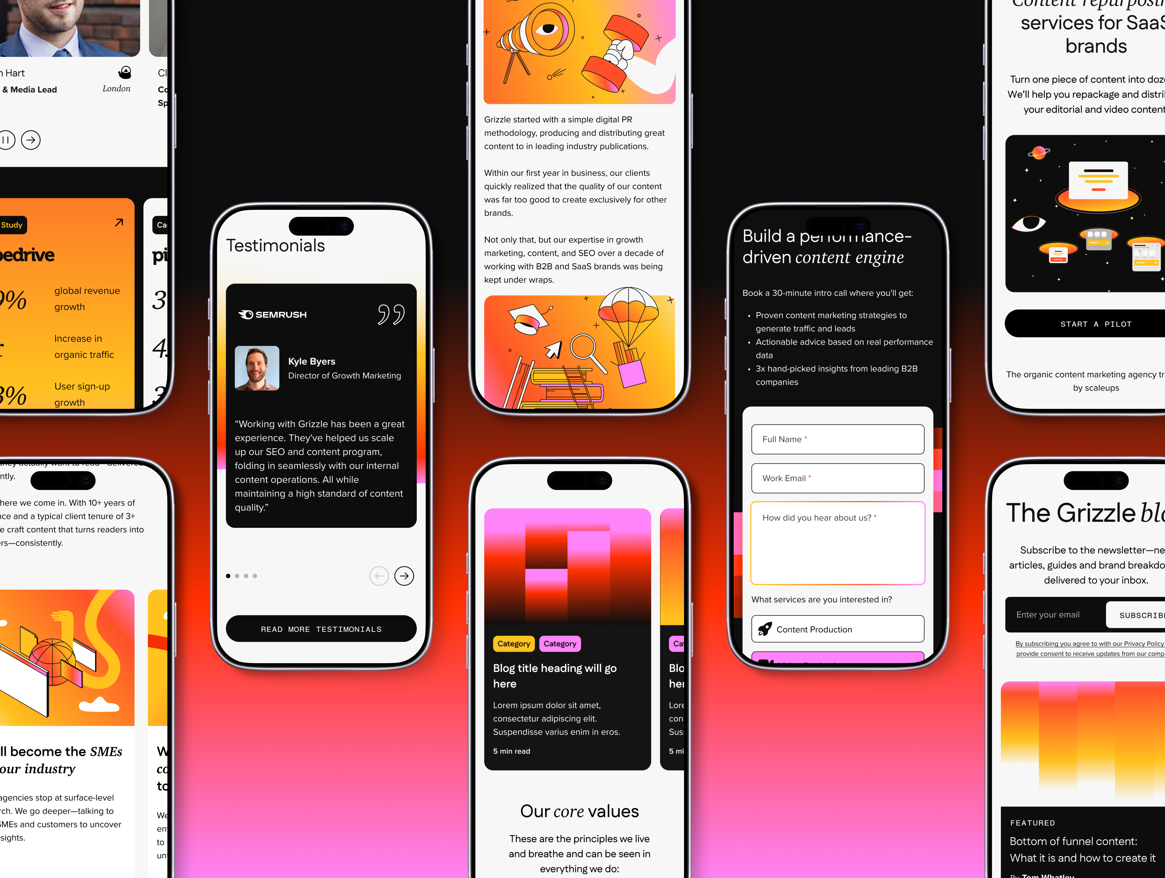
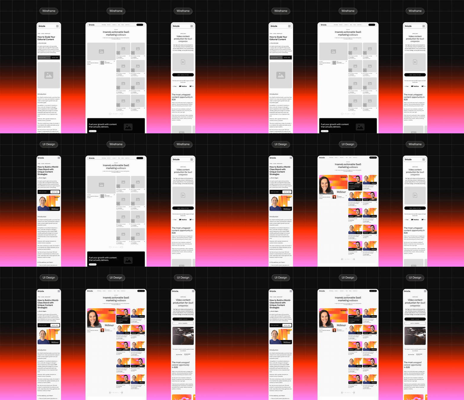
The wireframes were high-fidelity from the start. I ran that phase in parallel with the final weeks of the brand sprint so we didn't lose time, and designed desktop and mobile together in weekly batches of three to four pages. Because the Grizzle team was seeing work weekly (the CEO, Head of Marketing, and Head of Content) I paired every delivery with a Loom walkthrough that explained user flows and the rationale behind key layout decisions. Most pages were approved in the first round with only minor tweaks.
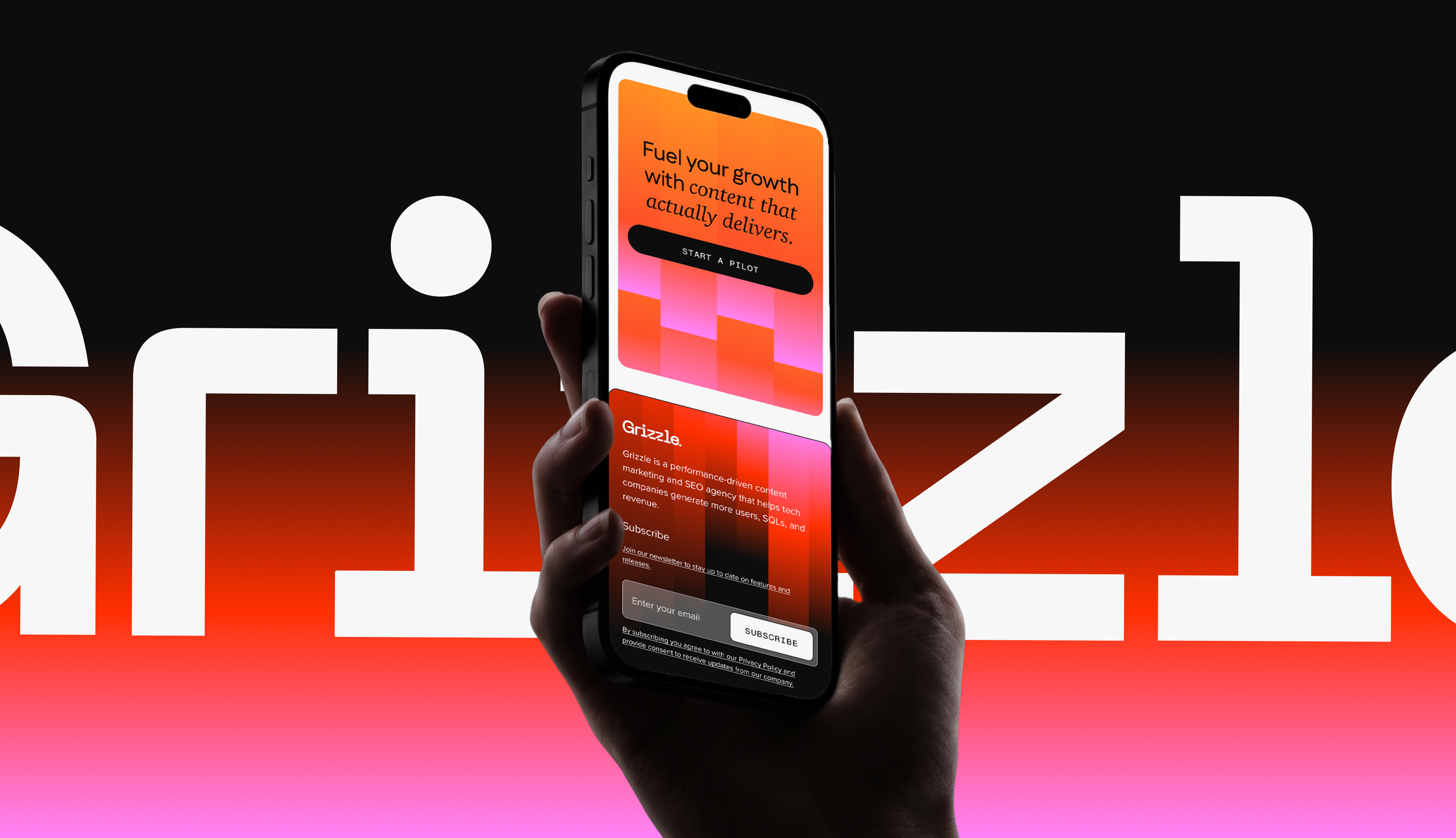
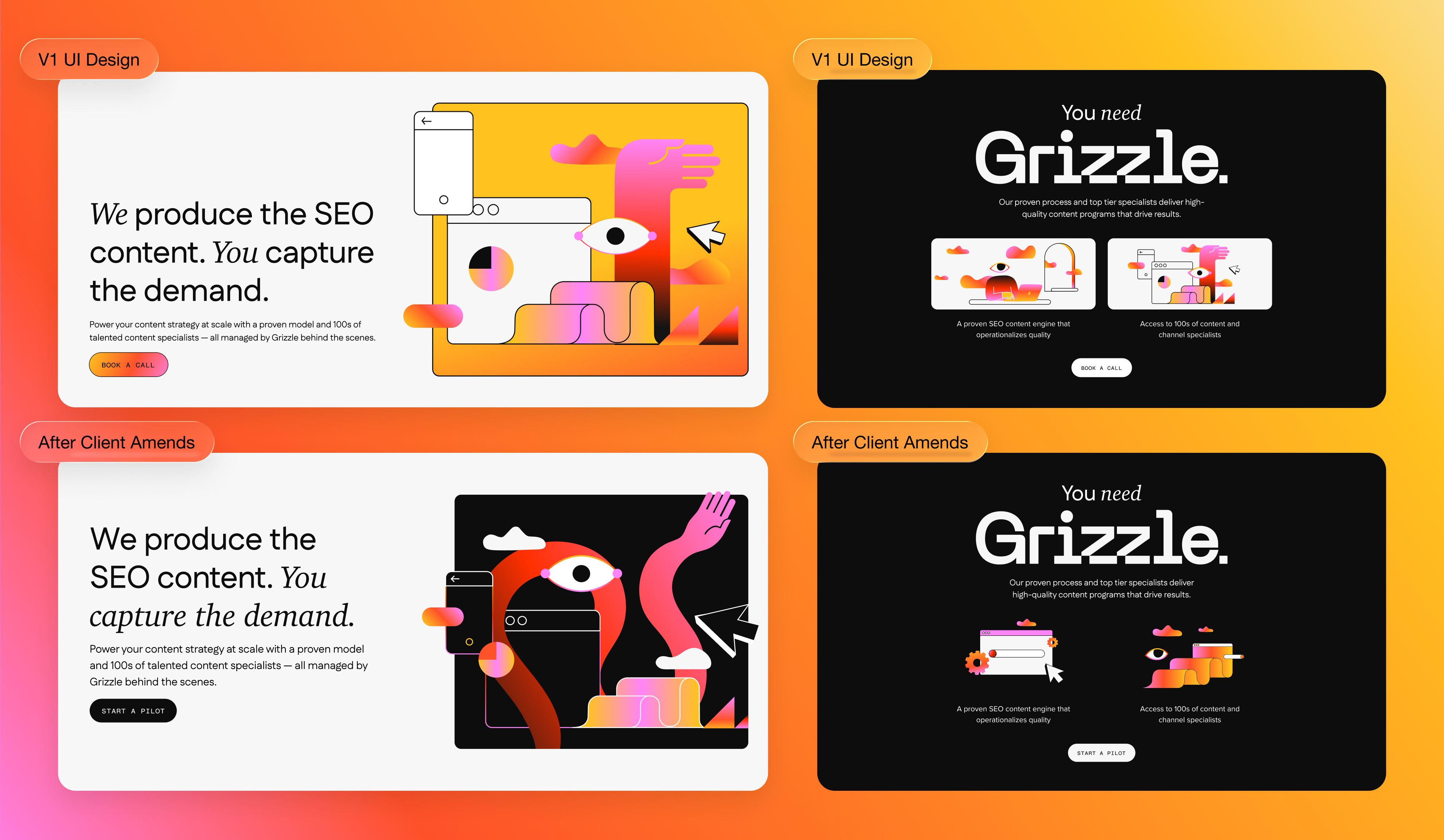
The brand was genuinely beautiful, with a vivid, specific colour system and a strong illustration language. However, applying it well in a web context required constant judgment. The palette was rich enough that it could tip into garish if over-applied; but pull back too far and you'd lose the character entirely. That balance had to be developed page by page, and it wasn't immediately obvious. When the client pushed back early on, asking for more black and fewer gradients in certain sections, they were right. The restraint improved the design. I took that feedback and recalibrated how I was thinking about colour density across the remaining pages.
The illustration style was another gap I had to fill. The brand guidelines covered the visual direction at a high level but didn't specify how illustrations should work across the range of web contexts we needed to cover. The brand designer had left the agency at this point so he was no longer available to consult, so I interpreted this direction myself. I worked closely with a graphic designer who came in to help produce the illustrations. The PM and I built out a shared tracking sheet to manage the volume across batches.
Throughout the project, I treated the dev handoff as an ongoing collaboration. I worked with the developer directly via huddles, Looms, and calls. When something wasn't immediately feasible, we worked through it together. Scaling issues that emerged in staging, for example, sections that broke at larger breakpoints, were flagged, diagnosed, and resolved with small targeted redesigns. Where I needed to communicate this to the client, I always paired the problem with the solution in the same breath.
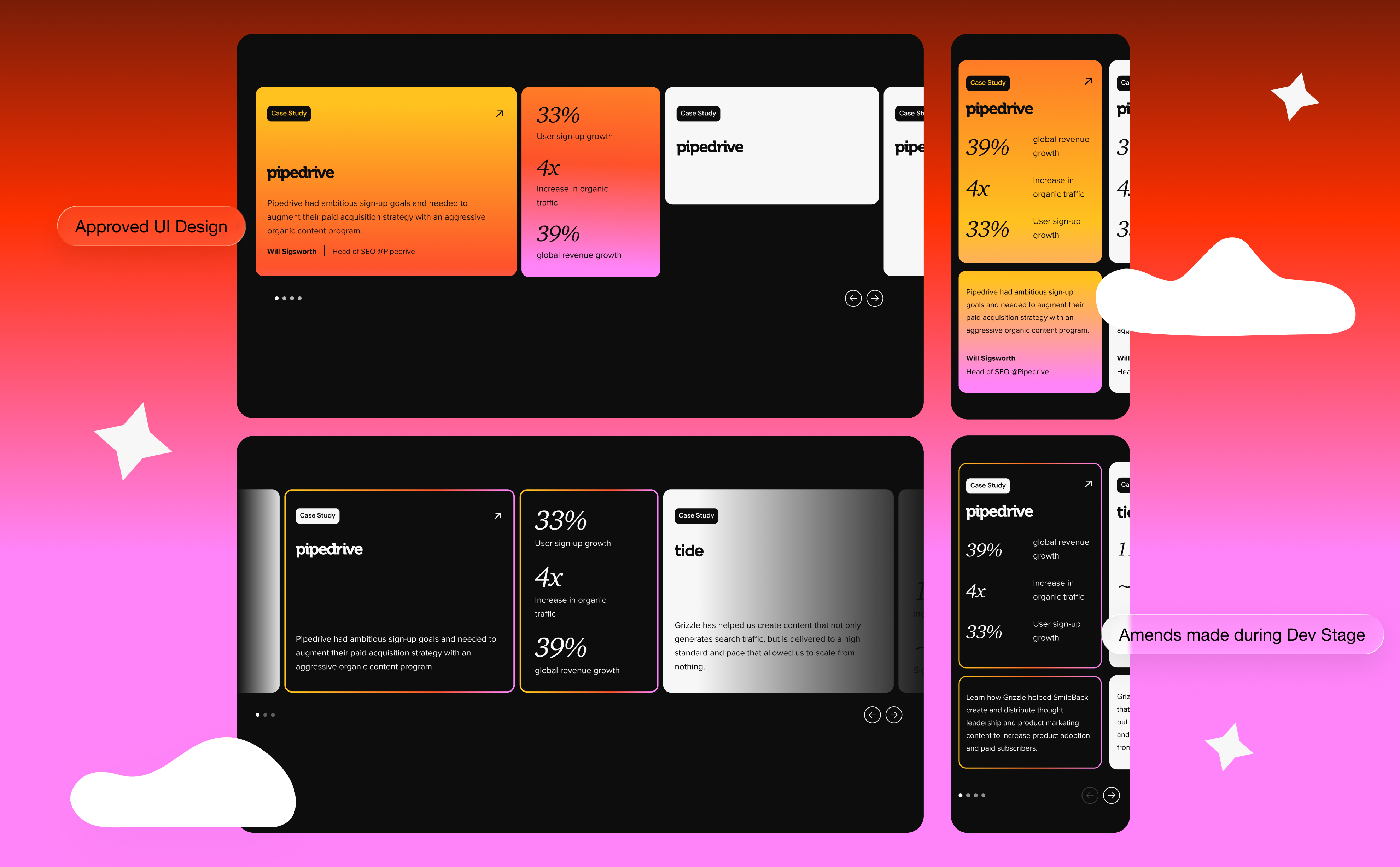
The wireframes set the structural foundation: layout, hierarchy, flow. Those decisions largely held through to the final UI. But I deliberately didn't treat the wireframes as fixed. The UI phase was where the brand had to come through properly, and that meant allowing layouts to evolve where the visual treatment required it. Spacing shifted. Sections breathed differently. Some components looked significantly different once the colour and illustration system was applied.
Key decisions in the final design:
Colour restraint over maximalism. The brand system was rich enough that it could have been overwhelming. I made deliberate calls about where to let colour do the work and where to pull back, using black as an anchor in sections where the gradients would have competed with the content. The client's feedback early on reinforced this instinct, and it became a guiding principle across the site.
Components from wireframe stage. By building the component library locally from the wireframe phase, the transition to UI was efficient and consistent. Elements like the nav, footer, CTAs, case study tiles, and testimonial blocks only needed to be updated once to propagate across the site. At an agency pace of three to four pages per week across 3-4 client accounts, this decision made things practical and efficient.
Handoff as ongoing collaboration. The full UI was completed before development started, which meant we fortunately weren't designing and building in parallel and creating rework. I stayed close to the developer throughout: explaining interactions, resolving ambiguities early, and running multiple rounds of QA in Markup with a mix of live calls and annotated side-by-side comparisons.Mobile was designed alongside desktopthroughout, not treated as an afterthought. Interaction states were specified. Prototypes were built for any component with non-obvious behaviour.
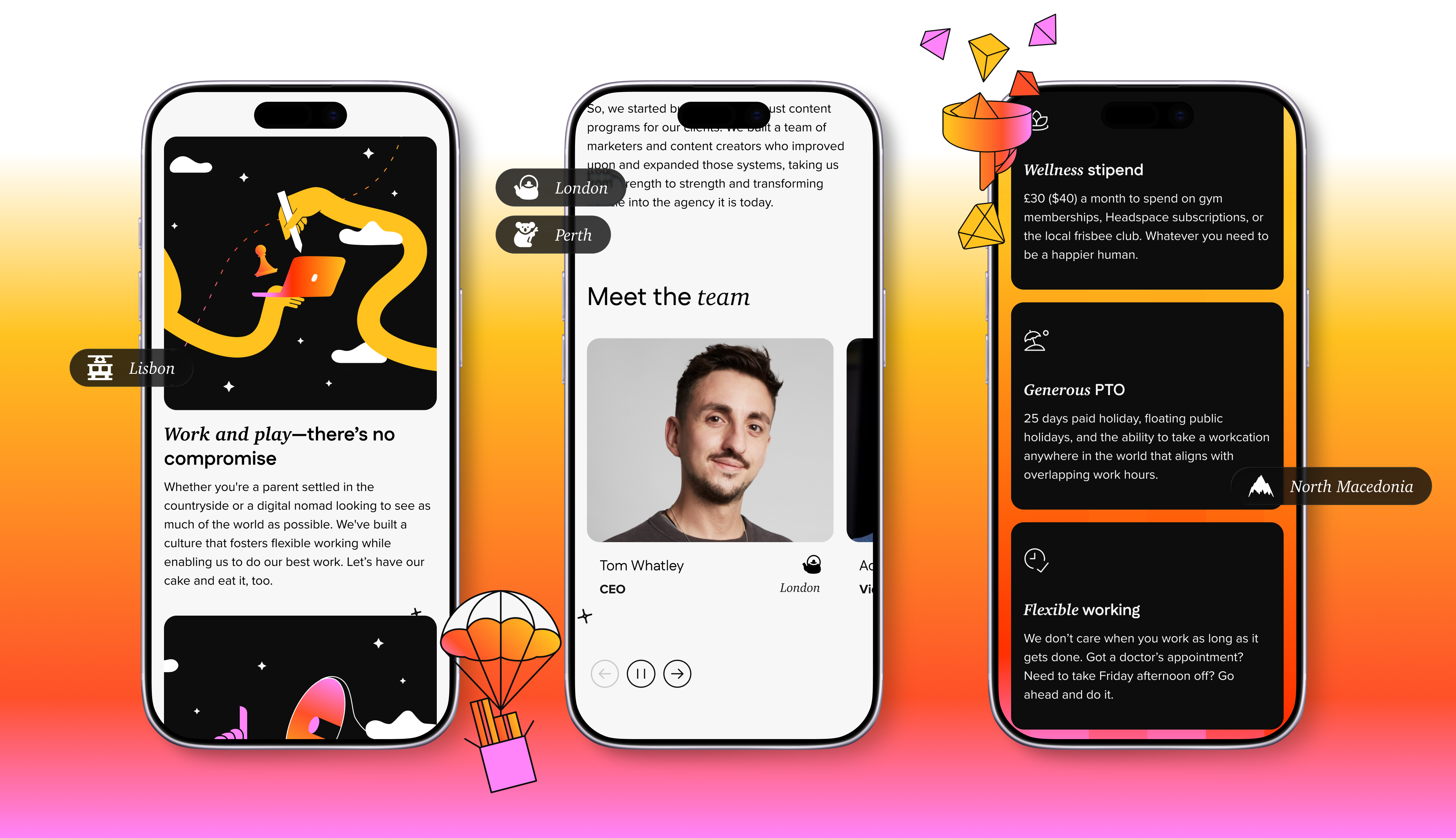
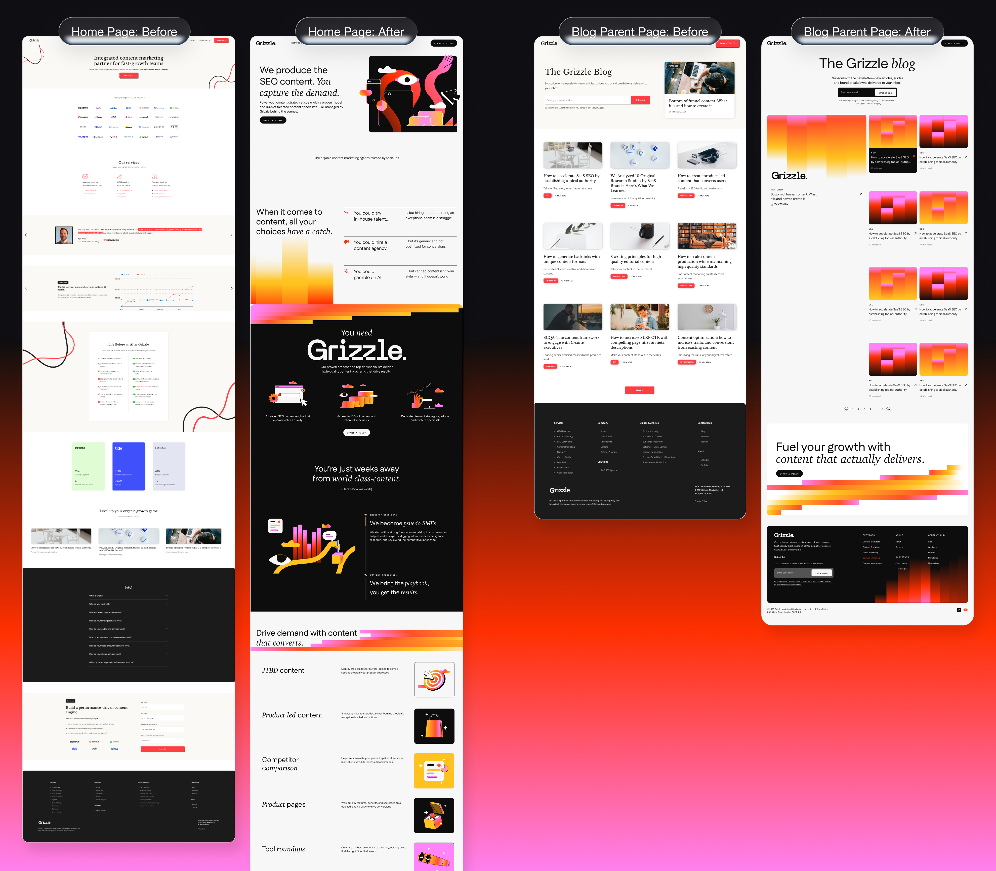
The project launched to strong reception. The CEO posted about it publicly on LinkedIn, describing how they'd set out to build something that felt B2C-inspired in a B2B context. Reactions from peers split between "wow, that's really f'ing cool" and "huh… that's f'ing weird", but never "that's boring." That was the brief, and the site delivered on it. The project was submitted for ADC award consideration, with a full case study video produced as part of the submission.
There are no conversion metrics available from this engagement as this was a fixed-scope brand and web project, not an ongoing retainer with reporting built in. The qualitative signal was consistent: the client was happy throughout, stakeholder approvals were fast, the developer described it as one of the smoothest builds he'd worked on, and the case study became one of the agency's most-shared pieces of social content.