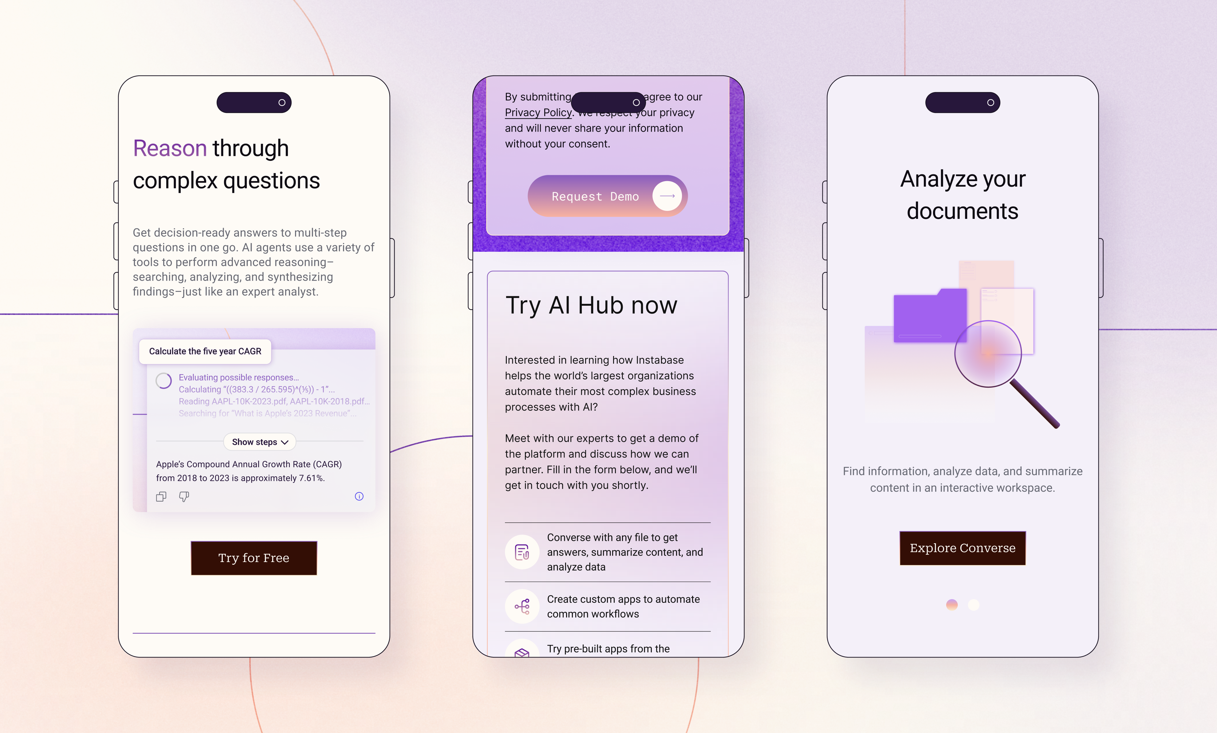
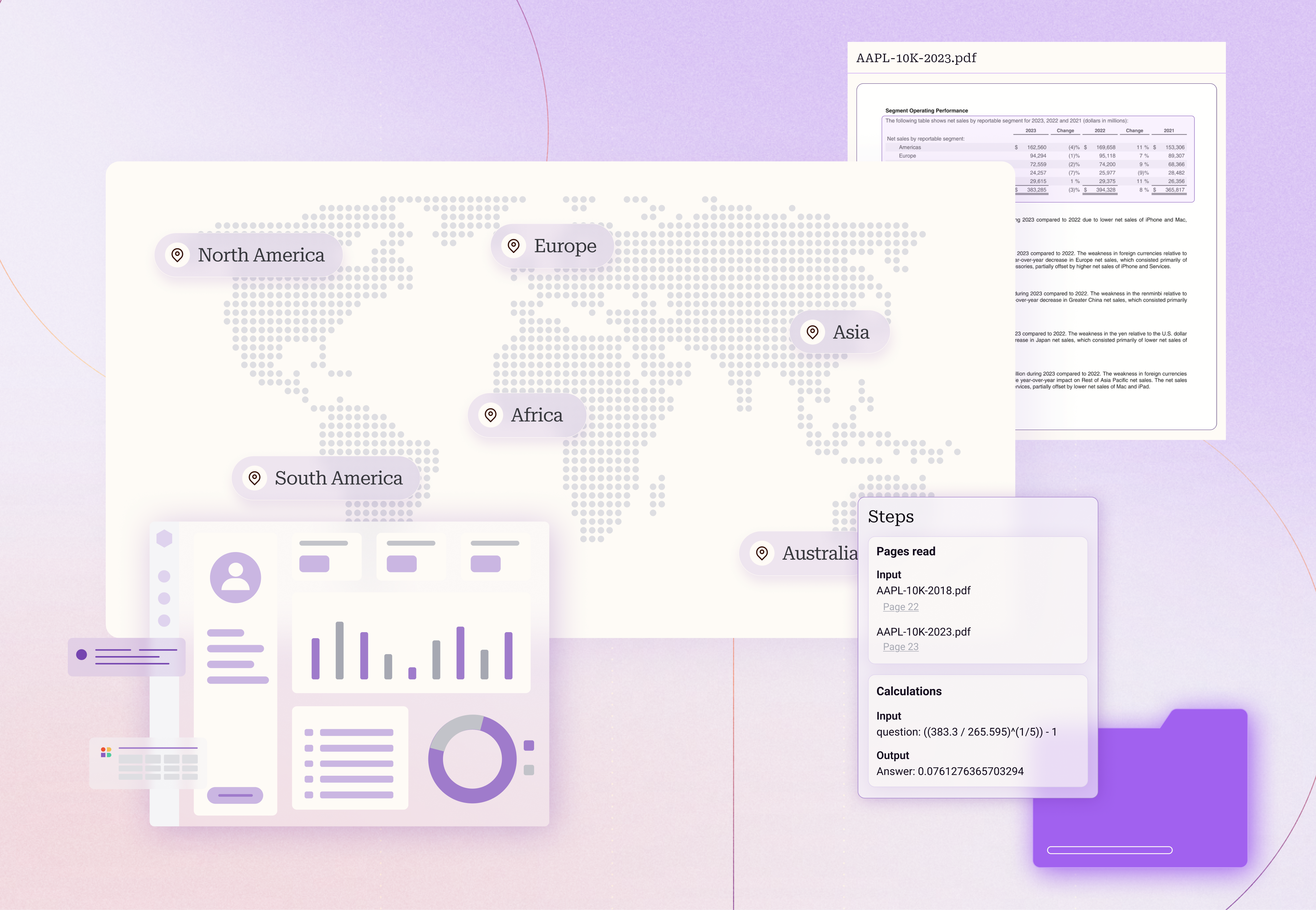
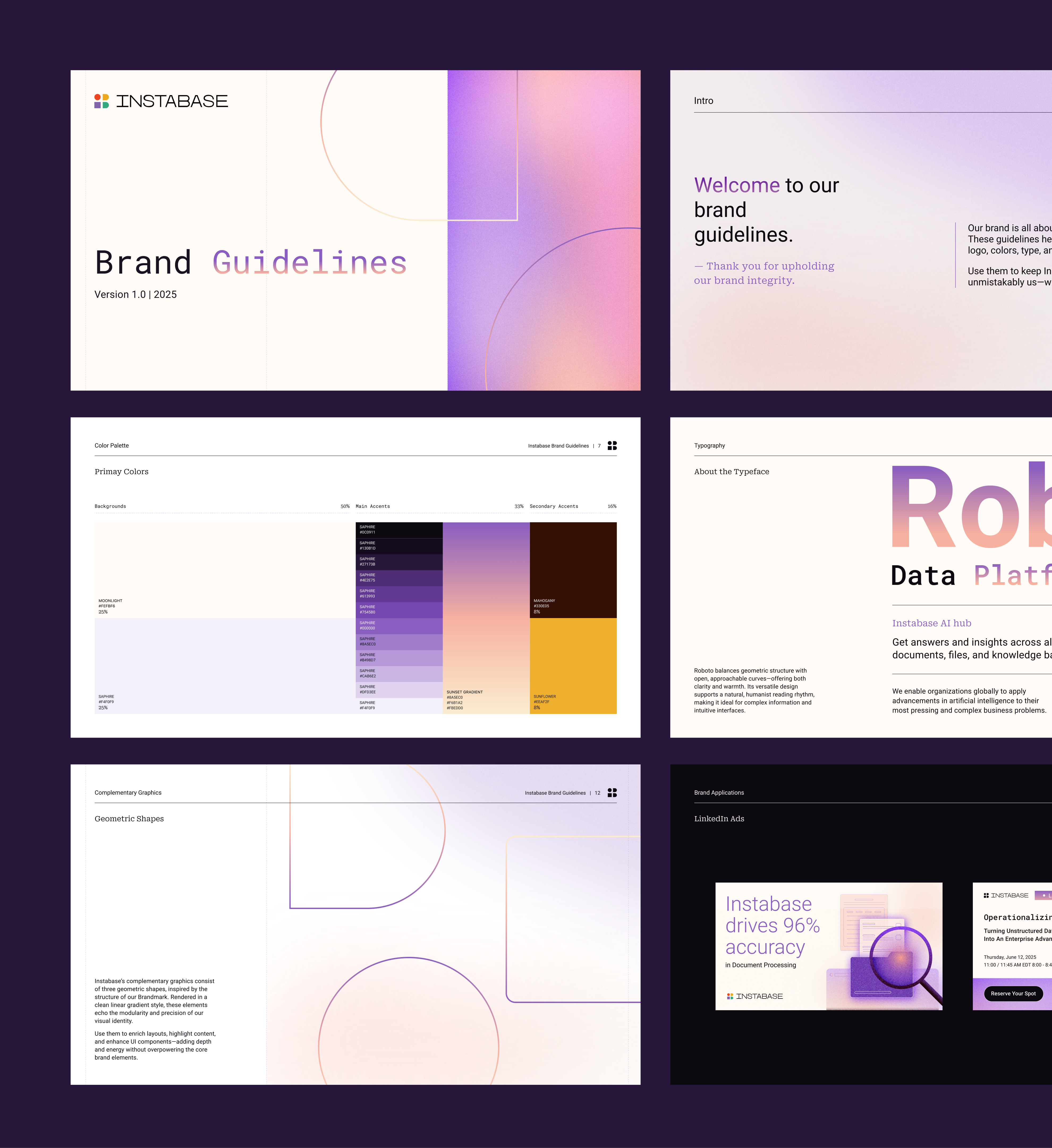
Instabase is an enterprise AI automation platform that helps large organisations extract and process information from complex document workflows. Their clients include major financial institutions and insurers. By early 2025 their brand identity had not been updated since 2019 and their website no longer reflected the company's current market position. The business goal was to complete a full brand and website redesign in the first half of the year, with conversion as a clear priority, specifically around demo requests and the introduction of a product-led growth motion. I joined the project midway through the website sprint to take over the UI design. Rather than starting with a blank canvas, I stepped into an active project where the focus was balancing delivery with improving the underlying design system.
Team
Creative Direction: Juan Pablo Project Management: Mafer Lopez Brand Design: Camila Candia UI Design: Juan Godoy & Laura Misuraca Webflow Developer: Usman Raza
Industry
Marketing, SaaS, B2B
Scope, Output & Timeline
~2 months (UI through to website launch) UI design + Dev Handoff & QC
Tools
Figma, Adobe Suite, Webflow, Loom, Markup
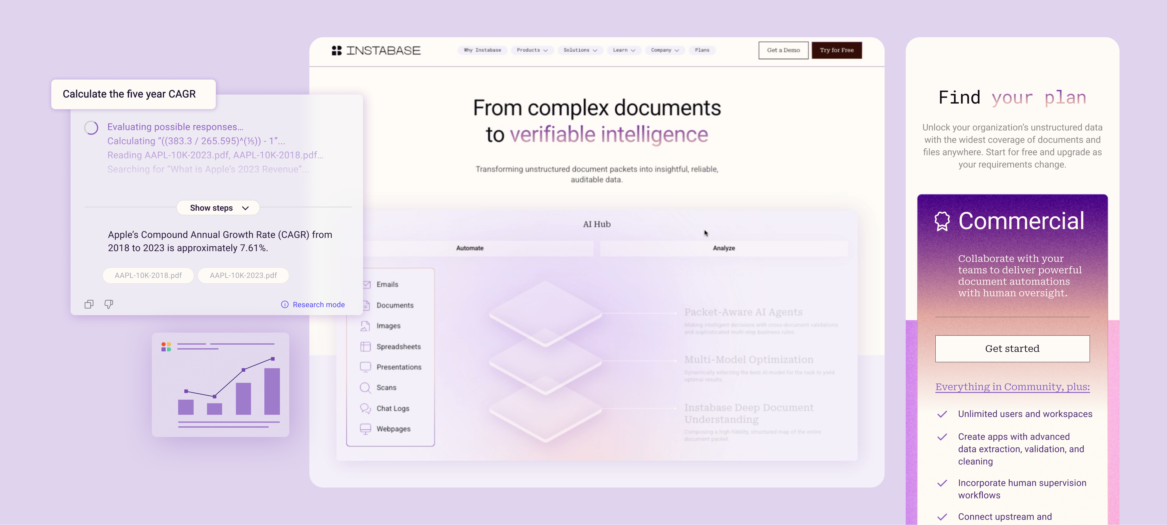
When I joined the project, the wireframes and around 20 desktop UI pages had already been completed. The visual direction had been established through the brand sprint and approved by the client, providing a solid creative foundation to build from.
The opportunity was in the underlying system. Core foundations such as colour and text styles, spacing tokens, reusable components, and interaction patterns either hadn't been fully established or needed consolidating into a scalable design system. Repeated elements had often been created as unique instances rather than shared components, and many interactive patterns, including buttons, forms, navigation, cards, accordions, and search, still required defined states and behaviours.
Auto layout had been applied inconsistently, and the mobile experience was still in progress. A large part of my role became restructuring the files, standardising the component library, completing the responsive rollout, and preparing the project for a smooth development handoff without disrupting work already underway.
I also identified an upcoming production risk around imagery. The site required a significant library of custom product imagery and illustrations, but there wasn't yet a clear production plan. Raising this early gave the project team visibility before it became a blocker.
One of the biggest constraints was that development had already begun on the homepage by the time I joined. As responsive issues started surfacing, it became clear the developer needed a stronger reference for how sections should scale across breakpoints. Rather than rebuilding the existing pages, we designed a fully responsive version of the homepage that demonstrated the intended scaling behaviour for every section. This became the reference model for rolling out the remaining pages, allowing us to improve responsiveness while keeping development moving.
The client was also working through evolving content requirements, with copy, imagery, and product assets arriving throughout the project. To keep everyone aligned, I documented outstanding requests through Loom walkthroughs and Slack, ensuring the agency, project manager, and client all had clear visibility of dependencies and progress.

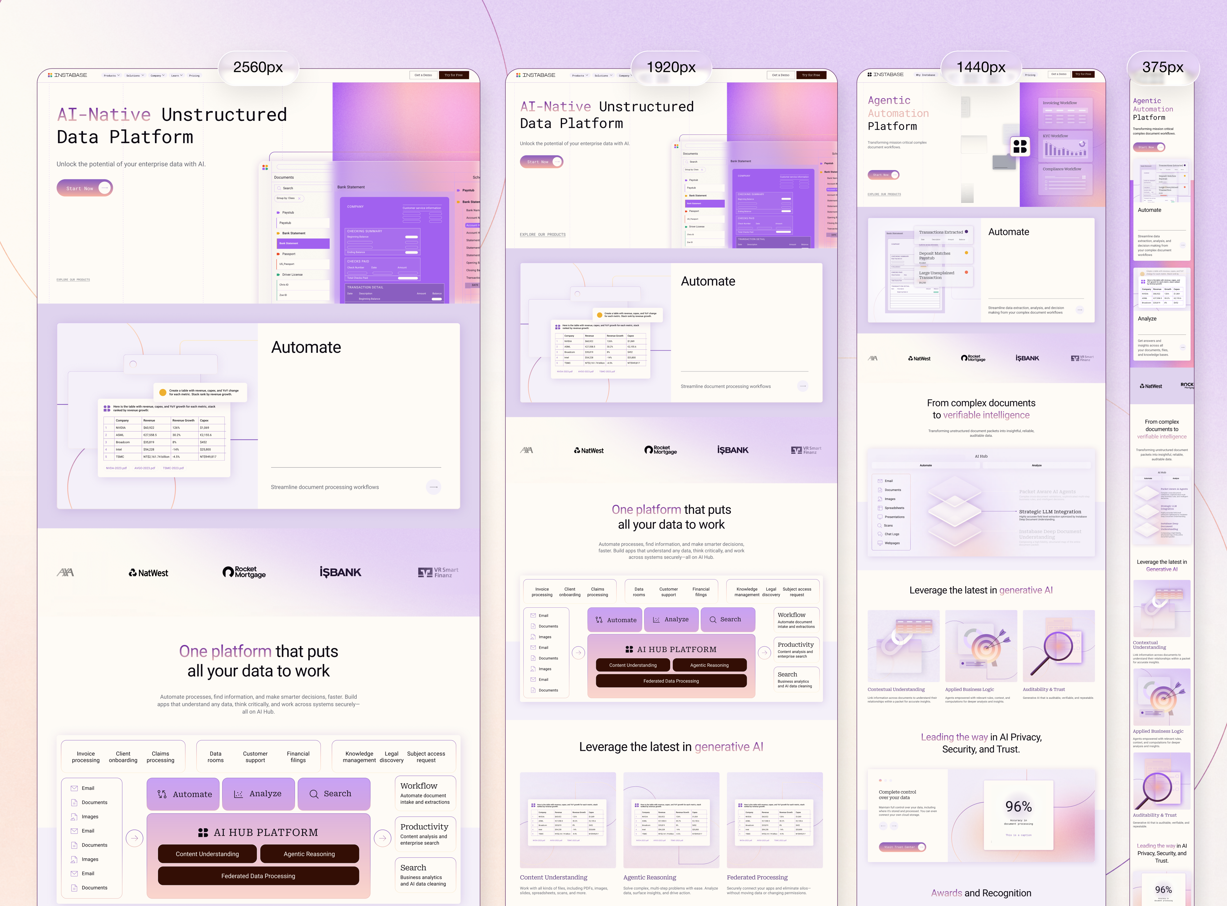

With development already underway, the first challenge was prioritisation. I couldn't stop the project and rebuild it from scratch, so I audited the existing work to identify which issues would have the biggest impact on scalability, development, and long-term maintenance.
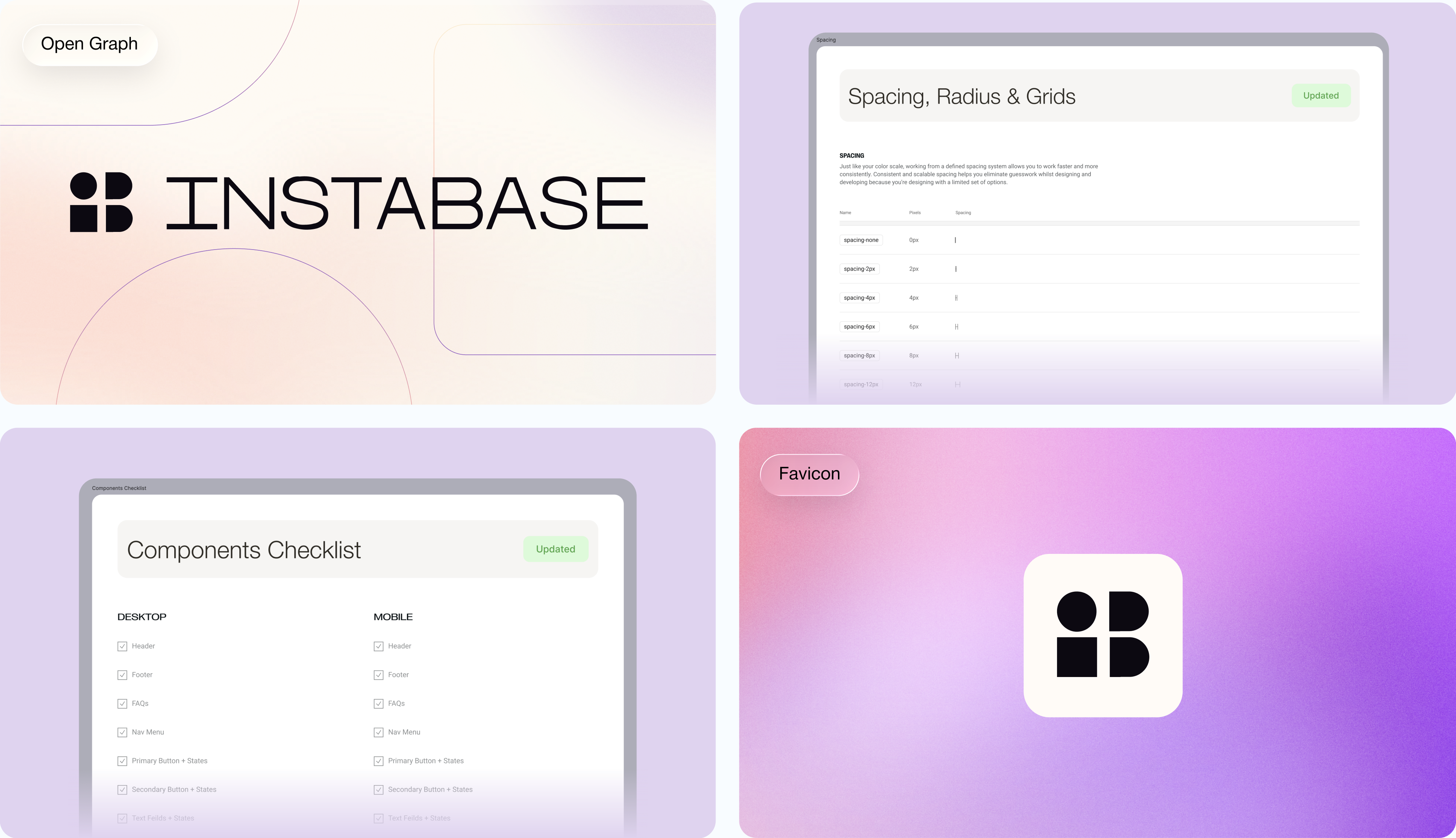
The first priority became building a design system, even though it wasn't originally in scope. Without one, every new page would introduce more variation and make the site harder to maintain after launch. I built the system alongside the remaining UI, covering foundations such as colour, typography, spacing tokens, grids, effects, and reusable components, along with complete interaction states for navigation, forms, buttons, cards, accordions, search, pagination, and responsive layouts. By building it incrementally, the project stayed on schedule while leaving the client with a maintainable library.
Once the system was in place, I worked through the site page by page, identifying layouts that wouldn't scale across breakpoints and resolving them without disrupting work already in development. Every change was discussed with the developer before implementation to ensure the design and build stayed aligned.
I also identified several production risks outside the UI itself. The project required a large volume of custom imagery that exceeded the remaining scope, so I prioritised the assets that needed bespoke design and created reusable templates for the rest. One example was the blog, where I standardised every image to a single aspect ratio and built a library of modular templates, allowing one asset to work across every thumbnail and hero placement. I paired this with Loom documentation so the client could continue producing content independently after launch.
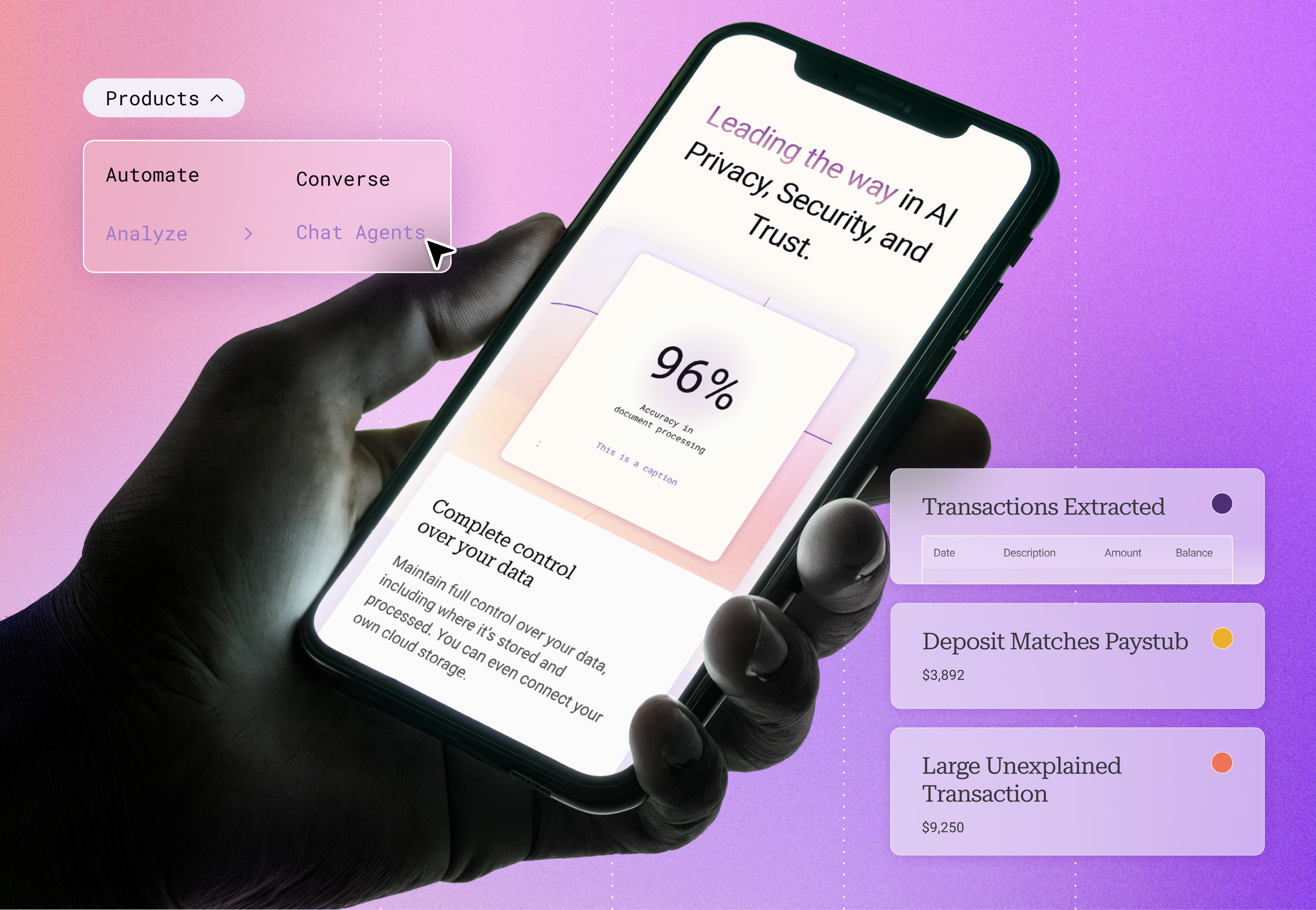
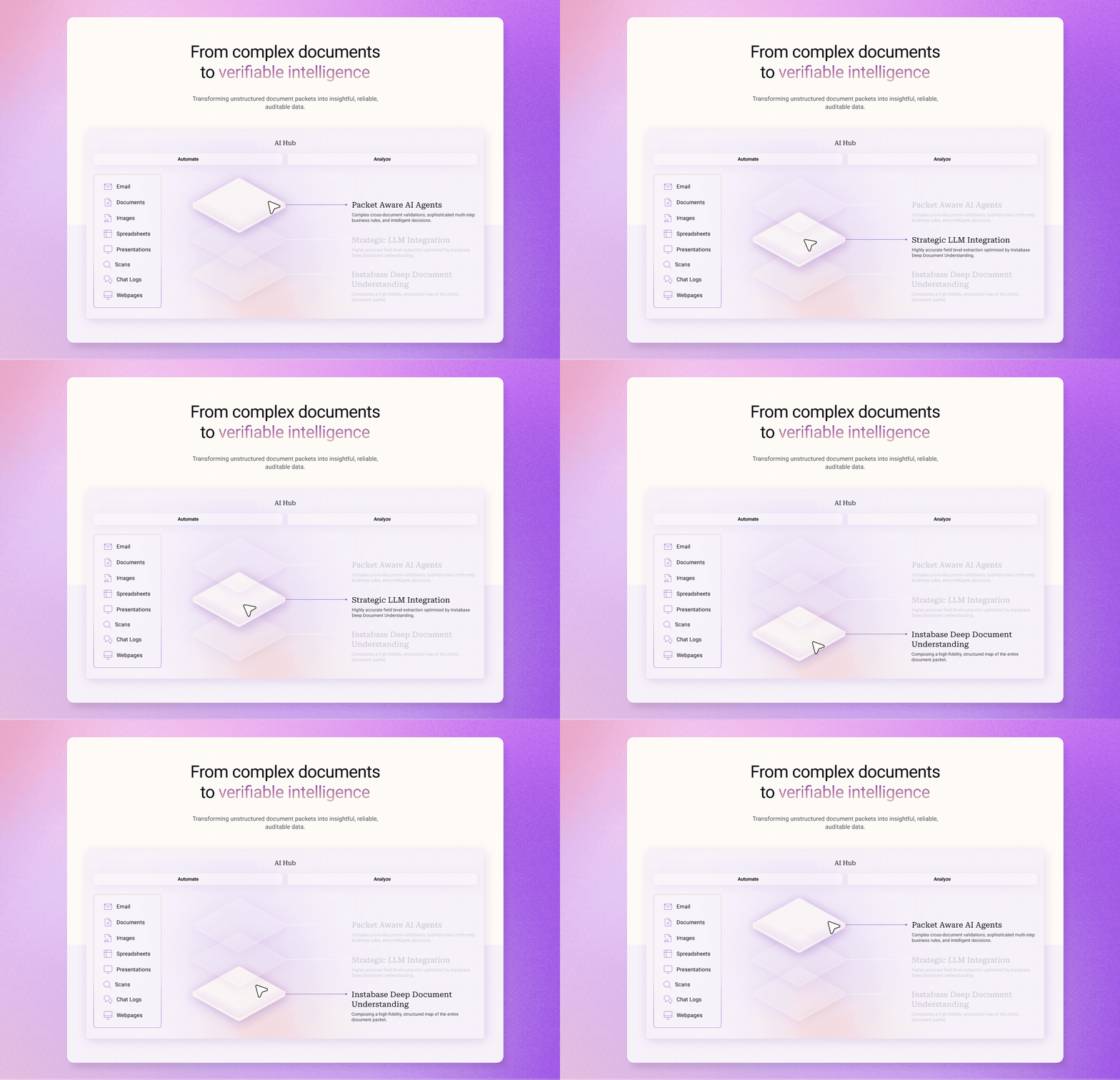
The client was also struggling to provide product assets on time, which regularly slowed progress. Instead of waiting, I created representative product visuals based on the information available. Having something tangible to react to prompted faster client feedback and helped surface the screenshots and details we needed without delaying delivery.
Alongside the UI work, I storyboarded motion concepts with the animator, maintained detailed project documentation through Loom walkthroughs, and kept the PM and creative lead informed of blockers, dependencies, and progress throughout the sprint. Much of the value I added wasn't just in designing new screens, but in identifying delivery risks early and putting practical systems in place to keep the project moving.
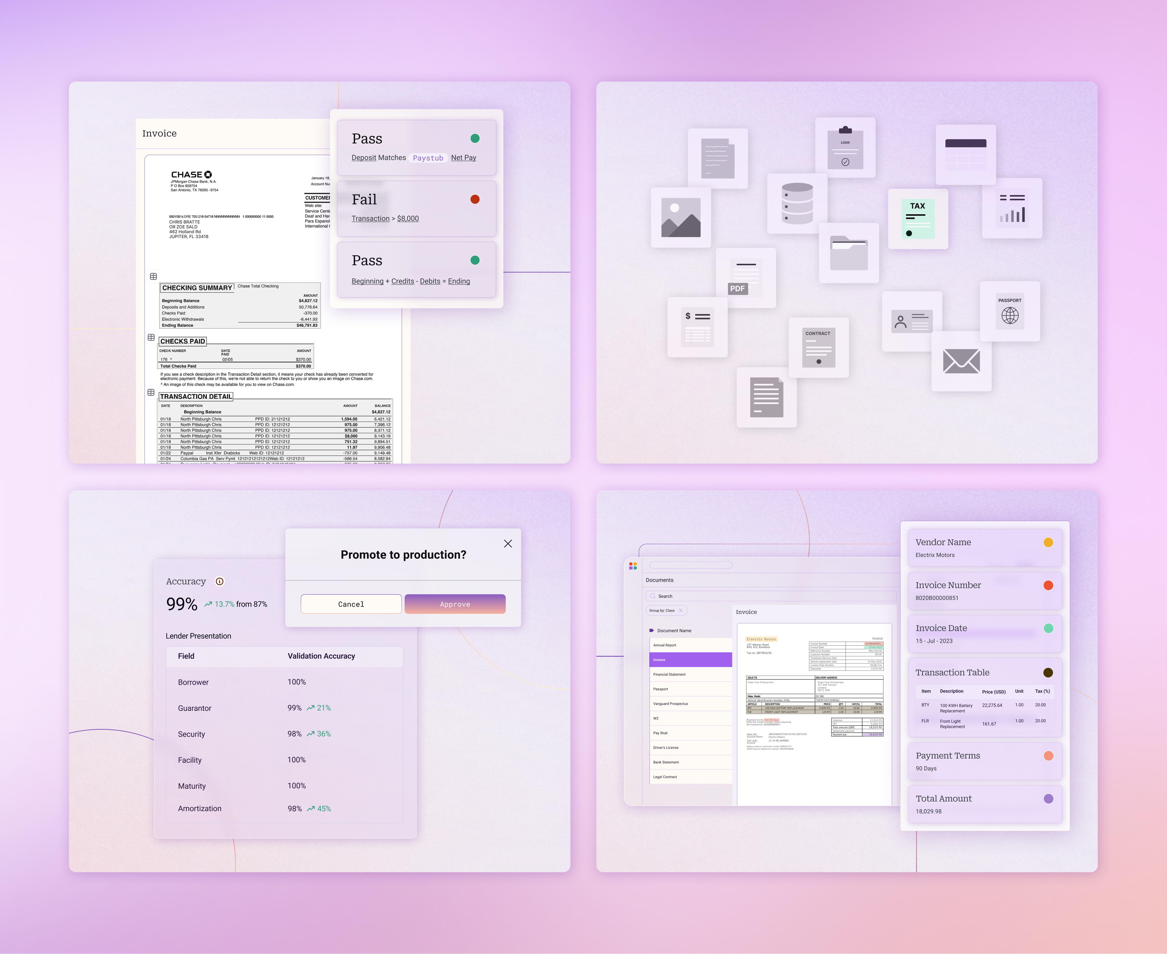
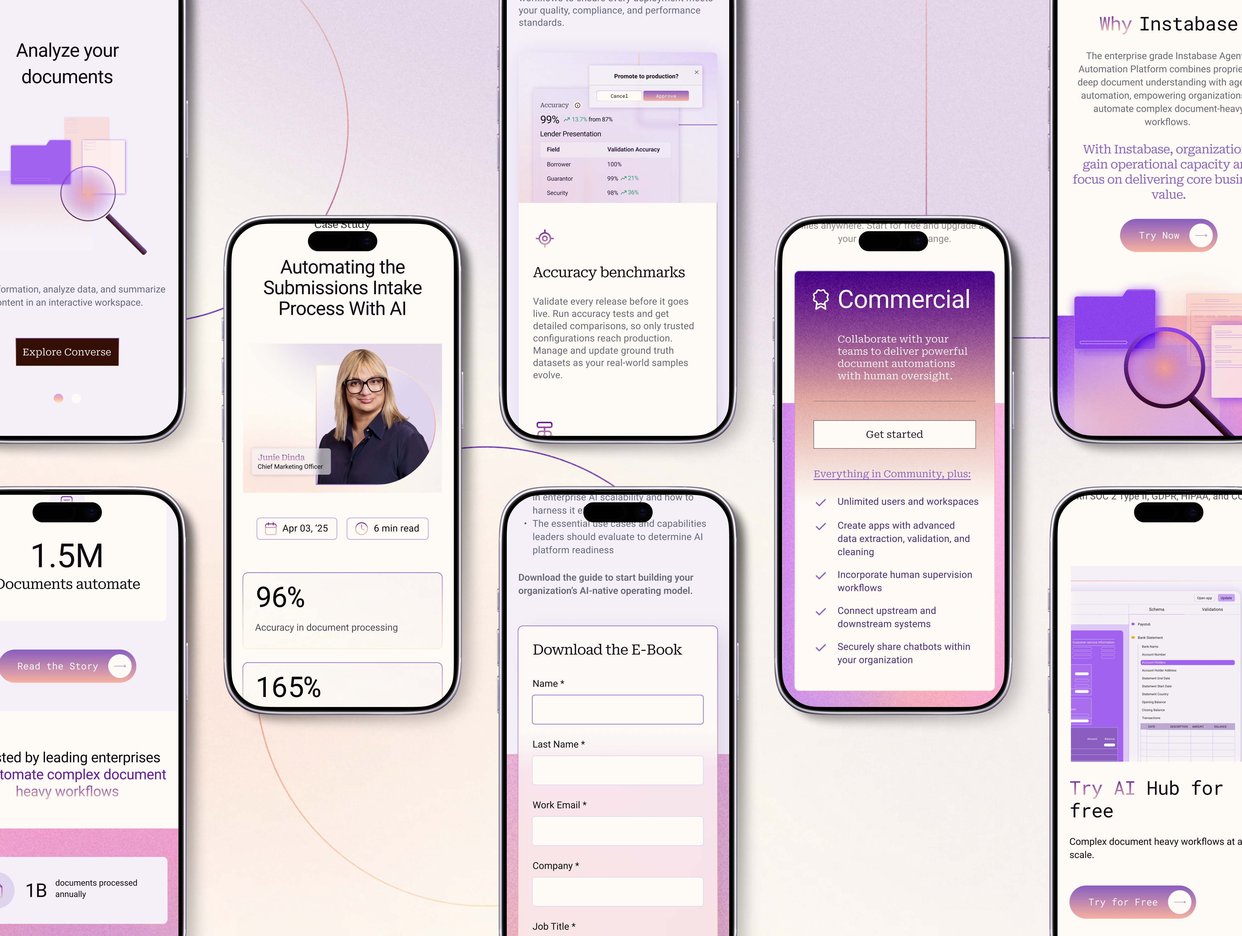
By handoff, the project had a completely different level of structure. The design system and component library gave the file a consistent structural foundation. Every interactive state was defined. Every page was annotated for development. Desktop and mobile were consistent with each other and built with correct auto layout throughout.
I completed 26 new UI design pages, all website images within scope, the full design system and component library, mobile cleanup across inherited pages, the mega menu, animation concepting and storyboards, and development QC. The pages covered Request a Demo with success states, Pricing, Why Choose Instabase, Glossary, Marketplace listing pages, Company, Careers, Customer Portal, Customer Case Studies, all Legal pages, Solutions, four Product pages, and updates and refinements to pages designed earlier in the project.
The blog image system gave the client a practical, scalable way to manage their own content post-launch. Standardised dimensions meant one image file worked across every container on the site. The modular template library and embedded Loom tutorial meant they could produce new blog images independently and consistently, without returning to the agency for each one.
Development QC was built into my process throughout. I reviewed implemented pages against designs and raised discrepancies with the developer directly, which was especially important given the parallel workstream and the responsive issues inherited from earlier in the project.

The project was behind schedule when I joined. It was delivered on time within the revised timeline agreed with the client at the point of my onboarding.
The design system was not a scoped deliverable on this project. Building it proactively meant the work done here has a longer functional life than the website launch itself. Any designer working on Instabase assets in the future has a structured, consistent foundation to build from.
One thing I would approach differently: joining a project mid-stream with development already live made it clear how much can go unresolved when a full asset and deliverable audit does not happen before work begins. Earlier in a project I would now push for a complete content and asset inventory before any design work starts, so that scope reflects reality rather than assumptions. It is a conversation worth having at the outset, even when timelines are tight.