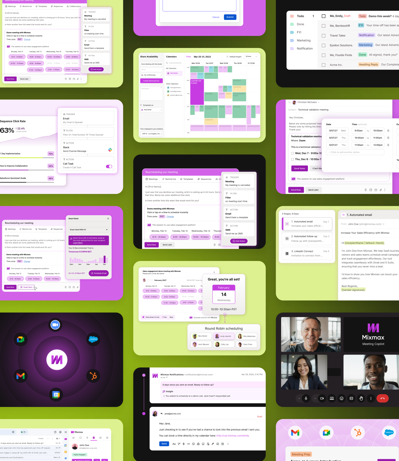
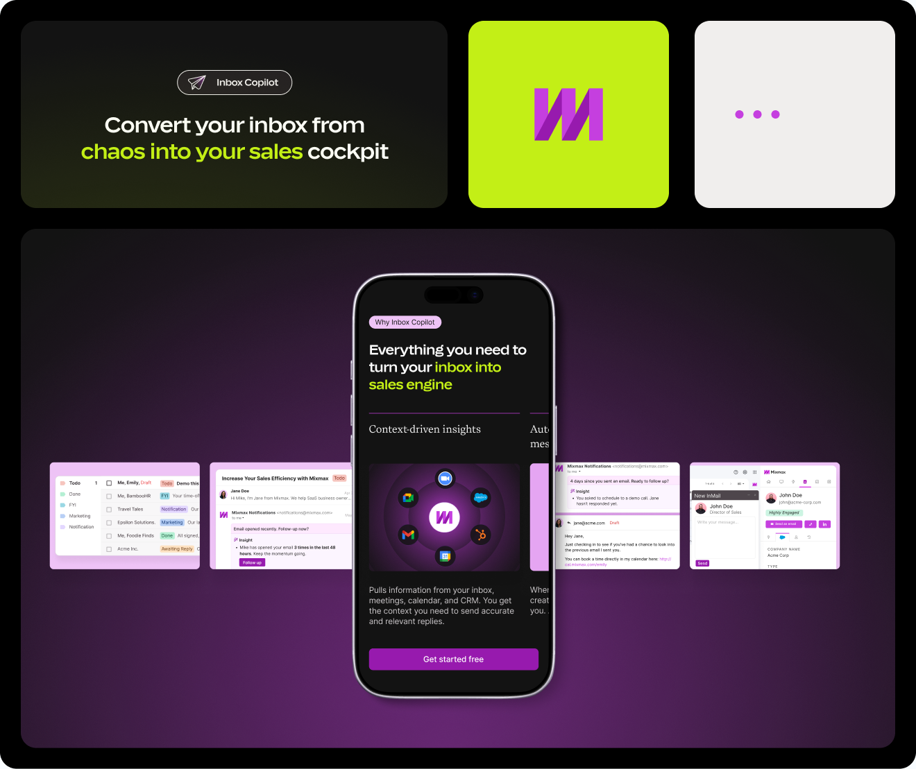
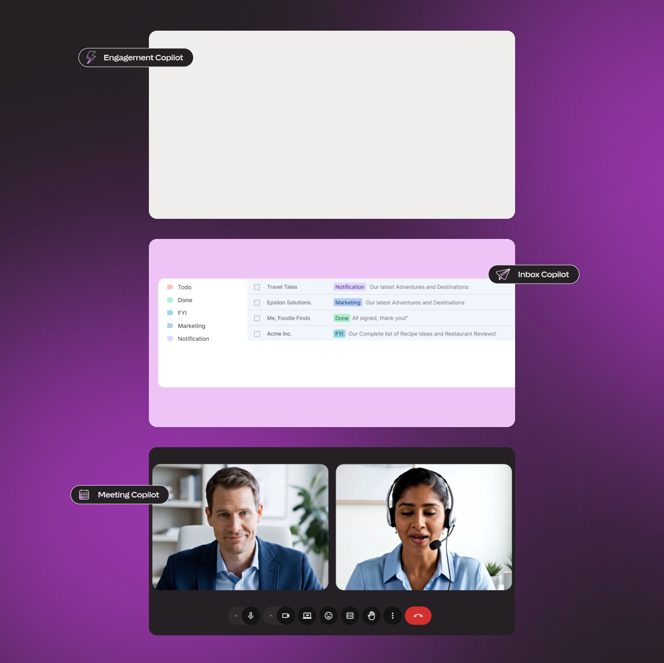
Mixmax is an AI-native sales execution platform for SMB sales teams that integrates directly into Gmail and Outlook, helping sales representatives identify the next best action to keep deals moving. After more than a decade as a traditional sales engagement platform offering email tracking, sequences, and scheduling, the company underwent a major strategic shift in 2025, repositioning itself around AI with the launch of a suite of modular AI Copilots and a completely restructured pricing model. I joined the project immediately after a full brand refresh had been completed within our agency. My role was to translate the new brand into a cohesive website experience, beginning with the pricing page, which was both the most commercially important and the most complex page on the site. The business objective was to clearly communicate Mixmax's new AI-first positioning, increase self-serve free trial signups, and establish a consistent digital experience across all marketing touch-points. From the user's perspective, the goal was much simpler: quickly understand the product offering, determine which solution best fit their workflow, and begin a free trial with as little friction as possible. The core design challenge was balancing these two needs: presenting a sophisticated product ecosystem while making the decision-making process feel simple, intuitive, and confidence-inspiring.
Team
Creative Direction: Juan Pablo Project Management: Mafer Lopez Brand Design: Yuliia Olomska UI Design: Laura Misuraca Webflow Developer: Stanislav Tsvek
Industry
Marketing, SaaS, B2B
Scope, Output & Timeline
~6 months (wireframing through to website launch) UI design + Dev handoff & QC
Tools
Figma, Adobe Suite, Webflow, Illustrator, Loom, Markup

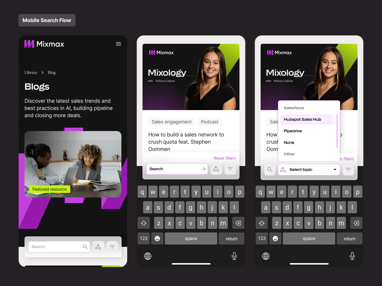
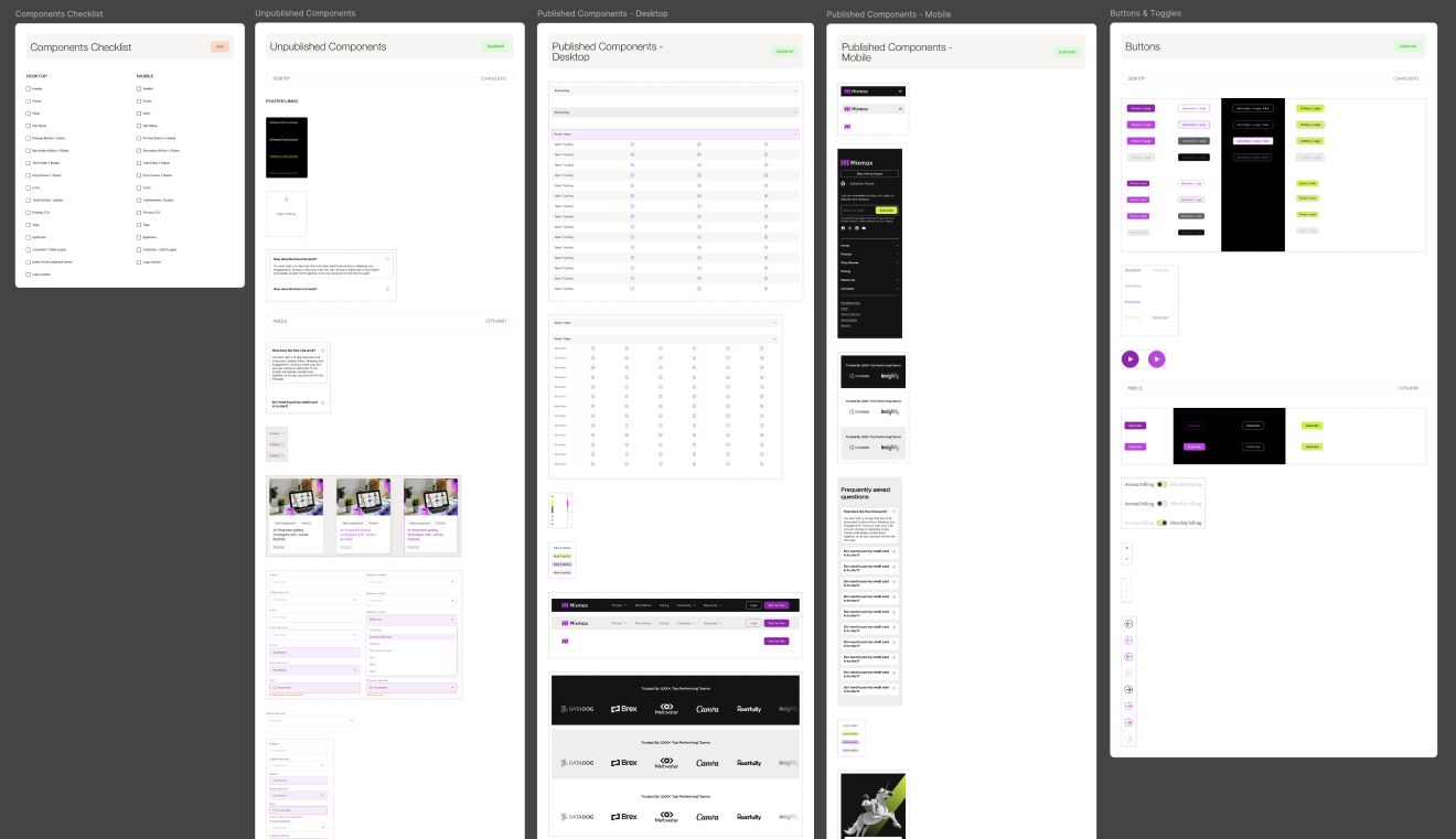
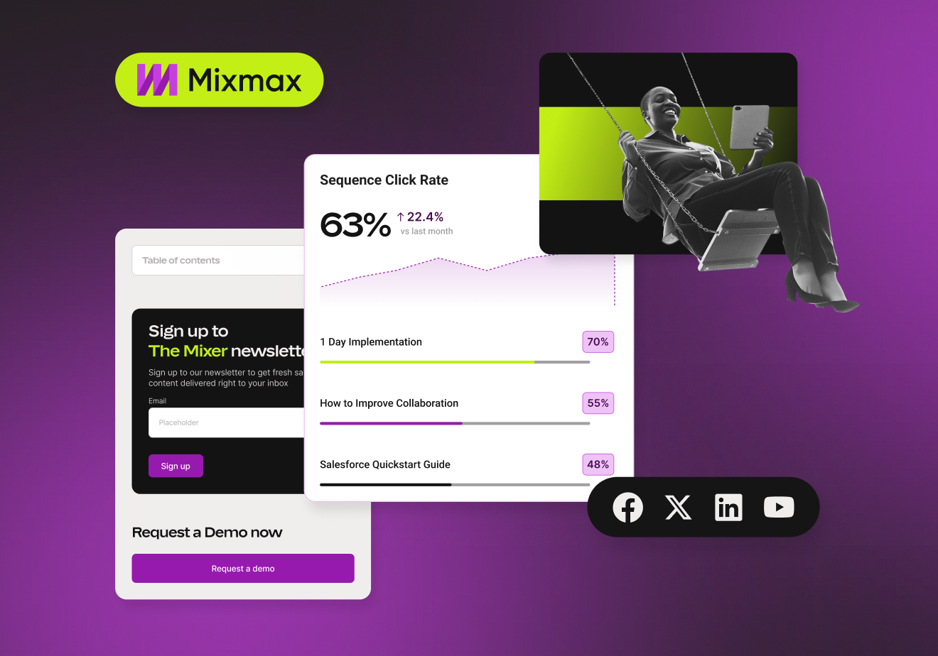
I joined the project after the branding phase had been completed, inheriting a comprehensive brand guide covering visual identity, typography, colour, and tone of voice. While it included high-level UI references, there were no production-ready digital components, such as button states, spacing rules, grids, or interaction patterns. I was responsible for building the UI foundation while simultaneously designing the website.
Before opening Figma, I immersed myself in the product and business context. I reviewed the brand discovery documentation, tone of voice guidelines, and the detailed pricing brief, which outlined the product structure, including the three modular AI Copilots, the Bundle, the Free plan, and the mandatory 14-day trial that introduced users to the platform.
During the first client presentation, it became clear that not all project context had been shared with the web design team before work began. Rather than treating this as a handover issue, I went back through the project's Slack history and reviewed every document related to the pricing page, including materials that hadn't originally been identified as design-specific resources. This uncovered several additional briefs and discussions that significantly influenced the information architecture. From that point on, I established a simple rule for myself: if a document existed, I read it before making design decisions.
Another defining challenge was stakeholder management. Review sessions included the CEO, VP of Revenue, Head of Marketing, and two in-house product designers, each bringing strong perspectives that were not always aligned. Navigating competing priorities, clarifying conflicting feedback, and maintaining momentum while guiding conversations back to user needs and business objectives became just as important as the design work itself.

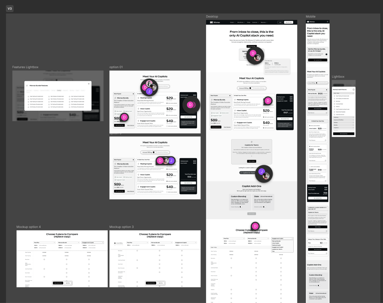
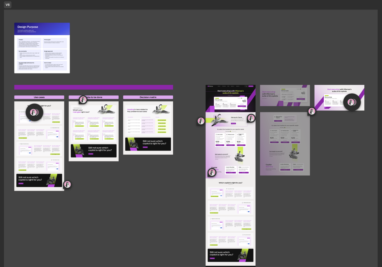
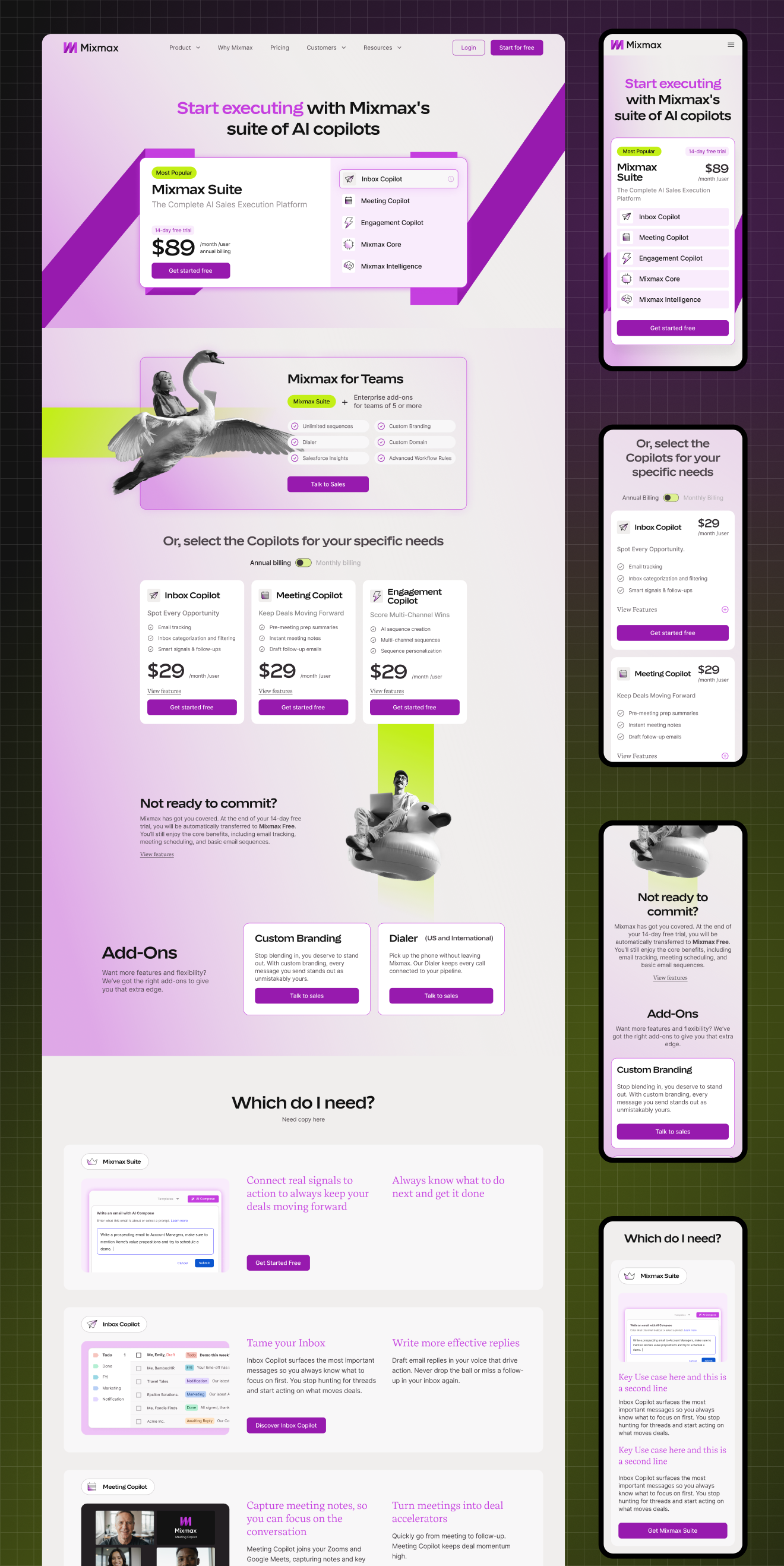
I started with the pricing page because it was intentionally the most complex part of the project. It went through five rounds of high-fidelity wireframes, followed by ten rounds of UI iterations. Several versions were developed and launched before further C-suite feedback showed users still found parts of the pricing model confusing, requiring another redesign. My initial solution followed a familiar SaaS pricing pattern, with six plans, a monthly and annual billing toggle, feature comparisons, and a comparison matrix. It aligned with the brief and the visual references provided by the client. However, it quickly became clear that their products weren't traditional pricing tiers. The three AI Copilots each solved different problems, while the Bundle, Free, and Enterprise plans all served distinct purposes. Presenting them equally created confusion, so I reworked the information architecture around a primary decision: positioning the Bundle as the recommended option, grouping the individual Copilots as alternatives, simplifying Enterprise into a contact pathway, and reframing the Free plan as a trial rather than a core offering.
One of the biggest challenges wasn't the design itself but stakeholder management. Feedback came from multiple senior stakeholders during live presentations and often conflicted with previous approvals or with each other. I addressed this by clearly explaining the reasoning behind every design decision, identifying contradictory feedback, and consistently steering discussions back to the project's primary goal: improving conversion rather than accommodating personal preferences.
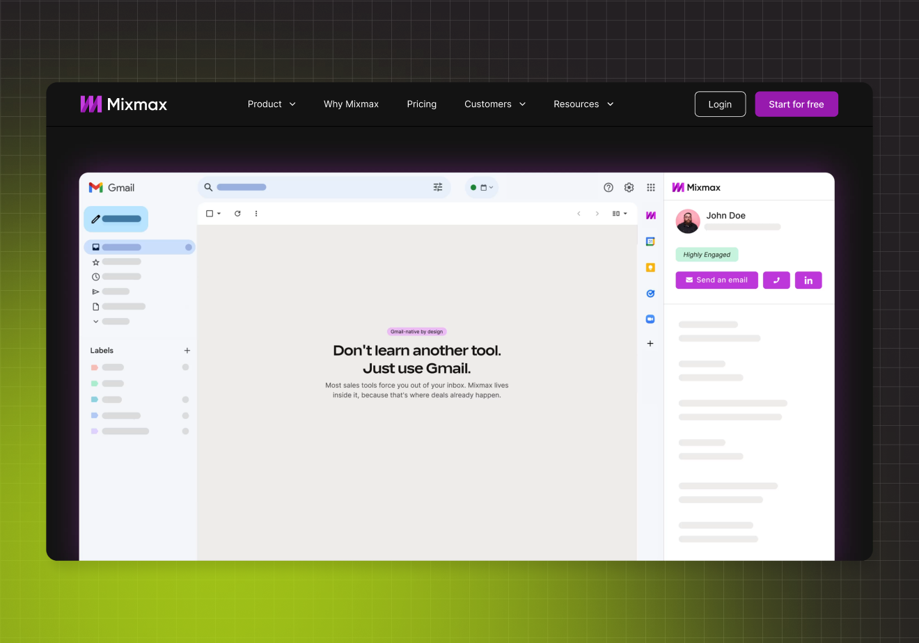
The homepage presented a different challenge. While it also went through multiple rounds of feedback, its role was much simpler: introduce the product, communicate value, and guide users towards conversion. One interaction I was particularly proud of illustrated how Mixmax works within Gmail. We had originally proposed this concept in the hero section, but it was rejected because it introduced too much product context too early. Instead, I repositioned it further down the page, after the value proposition had been established. As users scroll into the section, they transition into an abstracted Gmail interface where Mixmax is shown in context, making the interaction both intuitive and purposeful.
The final deliverable was a complete redesign of more than 40 pages across the Mixmax website, supported by a UI system that was designed and built from scratch alongside the website itself.
Pricing page: I restructured the information architecture to position the Mixmax Bundle as the primary and recommended product, with the individual AI Copilots grouped below as modular alternatives. The Enterprise offering was simplified into a contact pathway, while the Free plan was intentionally de-emphasised as a trial entry point rather than a primary product. To support decision-making, I designed a comparison matrix that displayed three plans at a time, accessible through a persistent anchor CTA, alongside a floating monthly and annual billing toggle. The visual hierarchy reinforced these priorities, with the Bundle clearly highlighted as the recommended option.
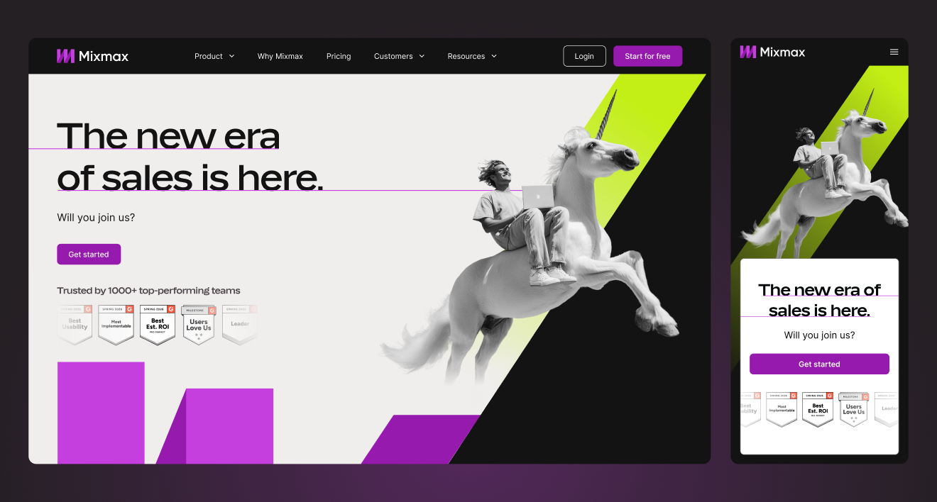
Homepage: The homepage introduced Mixmax's AI-first positioning through a product-focused narrative. The hero featured an interactive animation showcasing the AI Copilots within an authentic product environment, while the overall page rhythm used deliberate colour transitions to guide users through the story. A scroll-driven "How it Works" section progressively revealed each stage of the user journey, creating a clear sense of progression. Further down the page, a Gmail integration section used a zoom interaction to place users directly inside the product before introducing more detailed feature comparisons. Imagery was selected to support the message and emotional tone of each section rather than acting as decoration.
UI system: With no production-ready digital design system available, I built the website's UI system from the ground up. Every component included complete variant sets covering default, hover, active, selected, and disabled states, supported by design tokens for colour, typography, and spacing. This system became the foundation for every page and the primary handoff resource for development. Midway through the project, development transitioned from the client's internal engineering team to our agency after implementation challenges emerged. I consolidated the entire website into a single handoff-ready Figma file and prepared comprehensive documentation for the development team. This also provided an opportunity to refine the work as a whole, standardising component behaviour, aligning visual details that had evolved during the project, introducing subtle refinements where needed, and updating early pages to reflect the finalised brand system. The result was a significantly more cohesive and consistent design system than would have been achieved through page-by-page delivery alone. The site was then developed in batches of five to six pages per week, with me leading design quality assurance throughout implementation. This involved reviewing every page against the design system, identifying inconsistencies, resolving implementation issues, and ensuring the finished product accurately reflected the intended user experience.

The website launched in November 2025 and has continued to be iterated since, which reflects the nature of the project rather than a shortcoming — a pricing page serving a product in active commercial evolution will always need to move with the business. The site serves approximately 300,000 visitors per day. The engagement extended well beyond the initial scope into an ongoing retainer covering additional pages and marketing material rollout. Given how difficult the early phases were — particularly the pricing page, which involved the most stakeholder complexity I have managed on a single deliverable — that extension is the clearest signal of the trust built over the course of the project.
Client feedback across the team was consistently strong in the later phases. One stakeholder's internal message read: "I've been sooooo happy with the work from you, Laura, and the rest of the team so far. Please let them know they're doing a terrific job. When I was a student, it was my dream to work at a design agency as excellent as NBD. This is probably the closest I'll get to that dream."
What I would do differently: I would establish a formal consolidated feedback process earlier. The volume of live, sometimes contradictory feedback from multiple senior stakeholders in the same room created a significant amount of rework across the pricing page phase. I managed it as well as the context allowed — naming conflicts, anchoring to objectives, documenting decisions — but with a clear pre-agreed process for how feedback was to be gathered and consolidated before each presentation, the early phase would have moved faster and with less friction for everyone. That is the process change I would implement from day one on any multi-stakeholder project of this complexity.
Late in the project, the client moved to AI assisted development, which required full component annotation, accessibility documentation, and a properly structured design system. The design system I had built was thorough — every component built with full variant sets covering default, hover, active, selected, and disabled states, with colour variants, and a tokenised system covering spacing, colour, and typography — but did not include written UX documentation or formal accessibility annotation, which is what AI assisted development pipelines require. Our agency was not resourced to take on a project of that scope at the time. It is also exactly the kind of work I want to move towards. My background in psychology gives me a foundation for thinking about how information is structured, perceived, and processed — precisely what annotation and accessibility work requires: not just documenting what something looks like, but articulating why it works the way it does and how a user or system will interpret it. I go deep rather than wide. Building systems that a human developer and an AI development pipeline can both work from fluently is a problem I am well-suited to, and it is a direction I am actively developing.