Grizzle
2025
Designing a B2B website in a B2C style.
Grizzle was moving upmarket and needed a website that could communicate greater authority without losing the personality that set it apart. I translated its new brand into a distinctive digital experience across UX, UI, and responsive design.

Overview
A new digital identity for Grizzle
Grizzle is a London-based organic growth agency working with B2B and SaaS brands.
After nearly a decade with the same identity, the company was repositioning towards larger clients and needed a website that reflected that shift.
I joined the project as the brand sprint was wrapping up, taking the new identity into the digital experience across the site's structure, UI, responsive layouts, and component system.

The brief was simple: make B2B feel less predictable without sacrificing credibility.
Challenge
Standing out without losing credibility
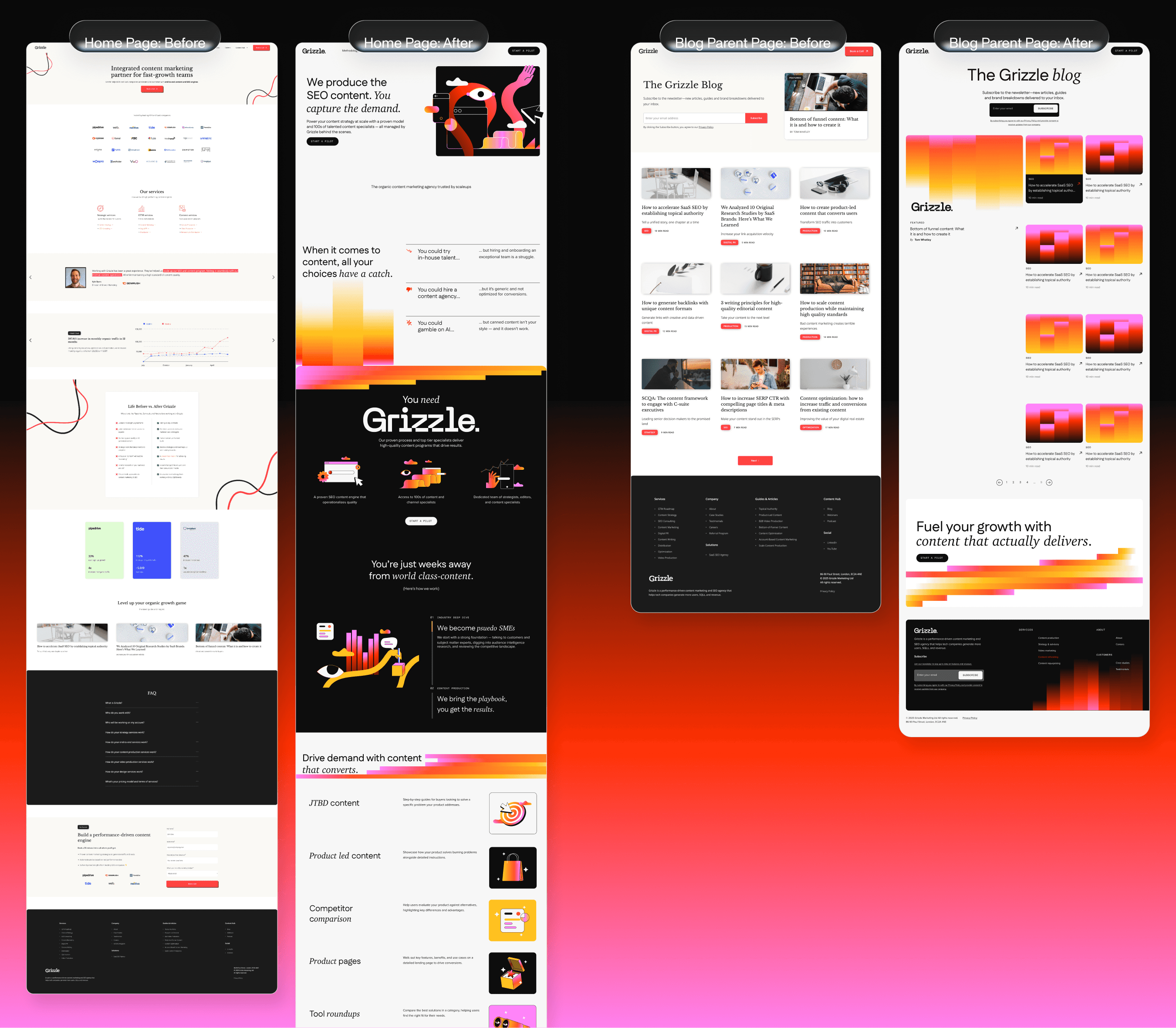
Grizzle's target audience was changing. The business was moving towards VP, Director, and CMO-level buyers at post-Series A companies, but its existing website wasn't communicating the authority needed to reach them.
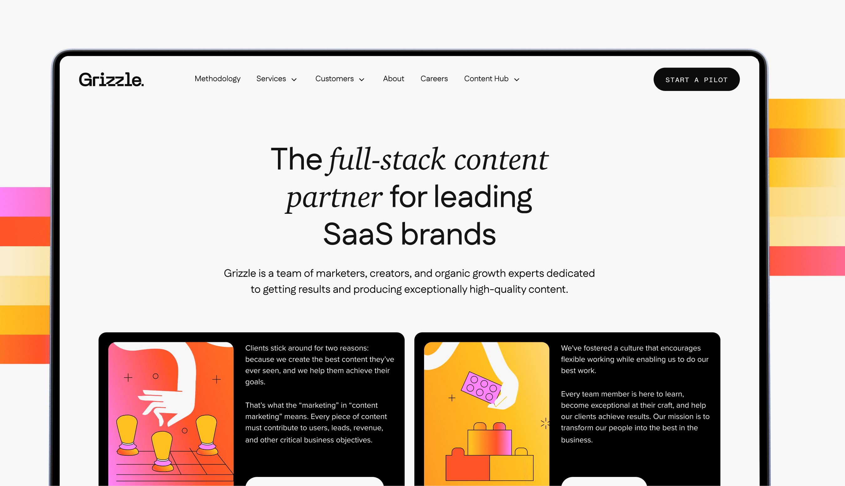
At the same time, the competitive landscape was visually conservative. Most agencies in the category relied on similar clean, minimal approaches.
The new brand took a different direction: B2C-inspired, expressive, and deliberately less predictable.
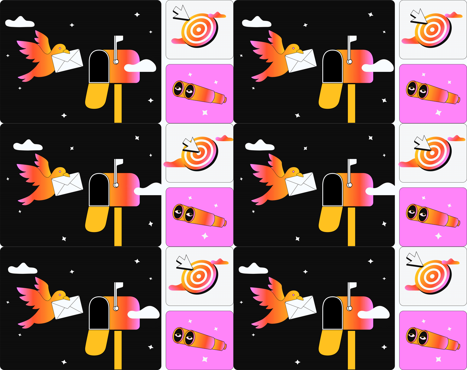

The challenge was turning that personality into a website that still felt clear and credible.
Discovery
Understanding the new direction
I came into the project at the wireframing stage, with the brand sprint nearing completion.
Before designing, I reviewed the kick-off questionnaire, ICP documentation, brand guidelines, and the visual references the client had provided.
The brand already had a strong point of view: a vivid colour palette, distinctive illustrations, and a more playful approach to B2B.

The challenge wasn't creating another visual language. It was understanding how much of that language the website could carry without compromising hierarchy or readability.
Exploration
Finding the right balance
The wireframes were high-fidelity from the beginning, with desktop and mobile designed together throughout the process.

I worked in weekly batches of three to four pages, using each round to test hierarchy, flow, and how the brand translated into different content types.

The biggest visual question was colour.
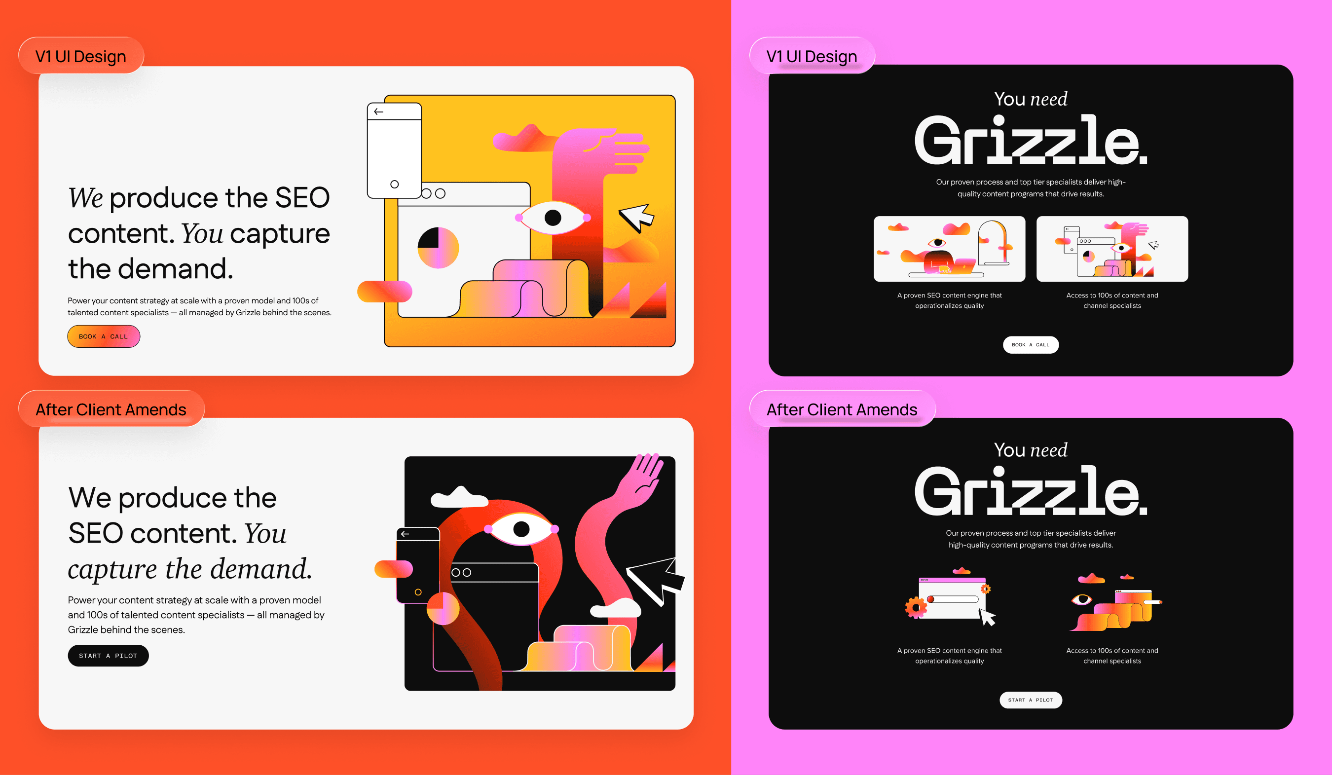
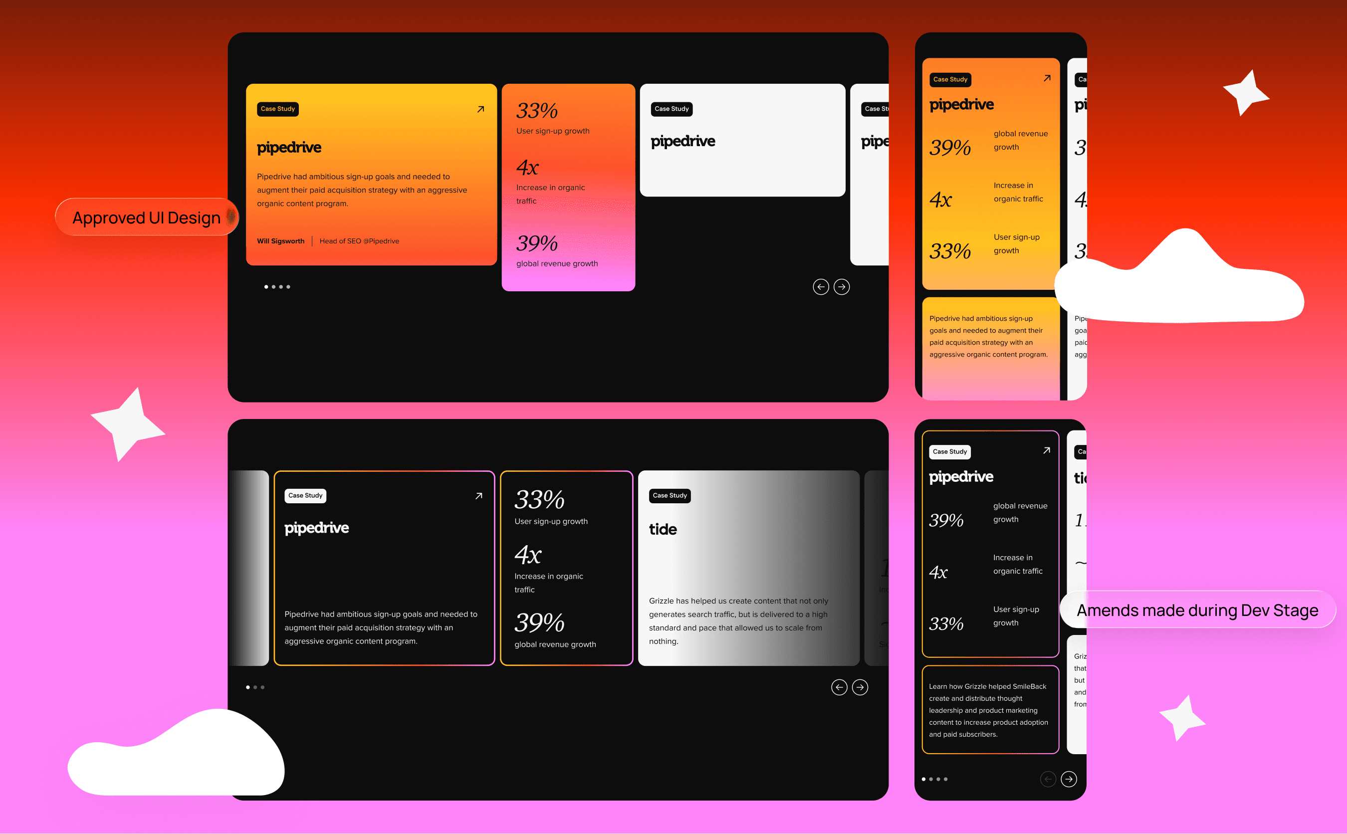
The brand was expressive enough that using every element at full intensity would quickly become overwhelming. I tested different levels of colour density and gradually established a more controlled approach.

Black became an anchor across sections where gradients competed with the content, while colour was reserved for moments where it could create emphasis.
Design
Translating the brand into a digital system
Once the visual direction was established, I applied it across the wider website while keeping the underlying structure consistent.

Repeated elements such as navigation, footers, CTAs, case studies, and testimonials were built as reusable components from the wireframe stage.
This meant changes could be made once and propagated across the site, while keeping the UI consistent as the number of pages increased.

The final layouts were deliberately allowed to evolve from the wireframes. Applying the colour and illustration system changed how certain sections needed to breathe, so spacing, proportions, and component treatments were refined throughout the UI phase.


