Instabase
2025
Bringing structure to an enterprise AI website in motion
Instabase is an enterprise AI automation platform helping large organisations process complex document workflows. I joined its website redesign midway through the project, taking over UI design while development was already underway. My focus was to bring structure to the existing work, build a scalable design system, complete the responsive experience, and get the site ready for launch without slowing the project down.

Overview
Joining a project already in motion
Instabase was undertaking a full brand and website redesign to better reflect its position in the enterprise AI market, with conversion around demo requests as a key business goal.
When I joined, the visual direction had already been established, around 20 desktop pages had been designed, and development had started on the homepage.

Rather than starting again, I worked within the existing direction and focused on identifying what needed to be strengthened, completed, or systematised to get the site to launch.

Challenge
Balancing delivery with design quality
The project was already moving when I joined, which meant there was little room to pause and rebuild everything from scratch.

Some of the underlying UI foundations needed consolidating, the mobile experience was still in progress, and development was already surfacing responsive issues. At the same time, content, imagery, and product assets were continuing to arrive throughout the project.

The challenge was to improve the experience without slowing down the work already underway.
Discovery
Finding the highest-impact problems
I started by auditing the existing work rather than immediately designing new pages.
The visual direction was already approved, so the focus was identifying the issues that would have the biggest impact on scalability and delivery. This included inconsistent Auto Layout, repeated elements that hadn't been turned into components, undefined interaction states, and responsive layouts that needed further development.
I also identified a production risk around imagery. The website required a large volume of custom product visuals and illustrations, but there wasn't yet a clear production plan.

Surfacing these issues early meant they could be addressed alongside the UI rather than becoming blockers later.
System
Building the foundation
The design system was one of the areas where I saw an opportunity to create leverage across the rest of the project.

I consolidated colour, typography, spacing, grids, and effects, then built reusable components for navigation, buttons, forms, cards, accordions, search, pagination, and other recurring patterns. Interaction states and responsive behaviours were defined alongside them.
The system was built incrementally alongside the remaining pages rather than stopping the project to create it separately.

Responsiveness
Using the homepage as the reference
Development had already started on the homepage when responsive issues began surfacing.
Rather than rebuilding the existing work, I created a fully responsive version that demonstrated how each section should behave across breakpoints. This became the reference for rolling out the remaining pages.

It also helped identify problems that weren't obvious in the desktop layouts, allowing them to be resolved before they spread across the wider site.
Exploration
Solving problems beyond the interface
Some of the biggest constraints weren't visual.

The website required a large library of custom imagery, while product assets and content were still being finalised. Rather than waiting for everything to arrive, I created representative product visuals that gave the client something tangible to review and react to.

For the blog, I created a standardised image system with a single aspect ratio and modular templates. This allowed one asset to work across different thumbnail and hero placements and gave the client a system they could continue using independently after launch.

Design
Completing the experience
With the core foundations established, I worked through the remaining site page by page.

I completed 26 new UI pages across Product, Solutions, Pricing, Company, Careers, Customer Case Studies, Marketplace, Glossary, Legal, Customer Portal, and Request a Demo, alongside updates to pages that had already been designed.
I also designed the mega menu, mobile refinements, animation concepts, and supporting website imagery.
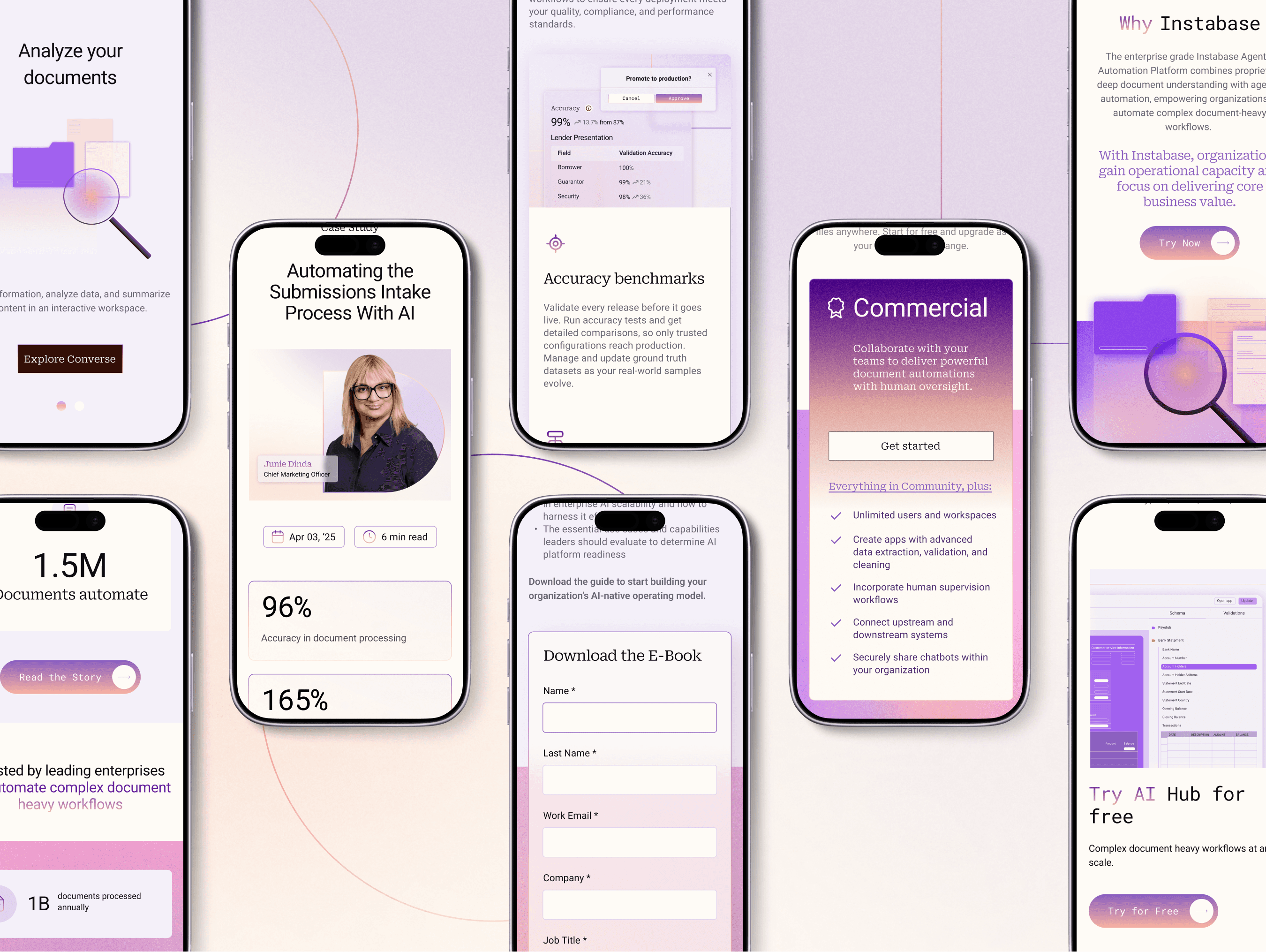
The goal throughout was consistency without making every page feel identical. The system provided the structure, while individual page layouts were adapted around their specific content and purpose.
Handoff & Outcome
Bringing the site together
The project was behind schedule when I joined, but was delivered on time within the revised timeline agreed at onboarding. I took the remaining UI work through to launch, refining layouts, resolving implementation issues, and working closely with development throughout the final stages.

By handoff, the project included 26 new UI pages, a complete design system and component library, responsive layouts, website imagery, animation concepts, and development QC. The design system gave Instabase a more maintainable foundation beyond launch, while the responsive homepage became a reference for the wider site.

The design system gave Instabase a more maintainable foundation beyond launch, while the responsive homepage became a reference for the wider site. Working closely with development throughout the final stages helped ensure the finished experience stayed consistent across breakpoints.


